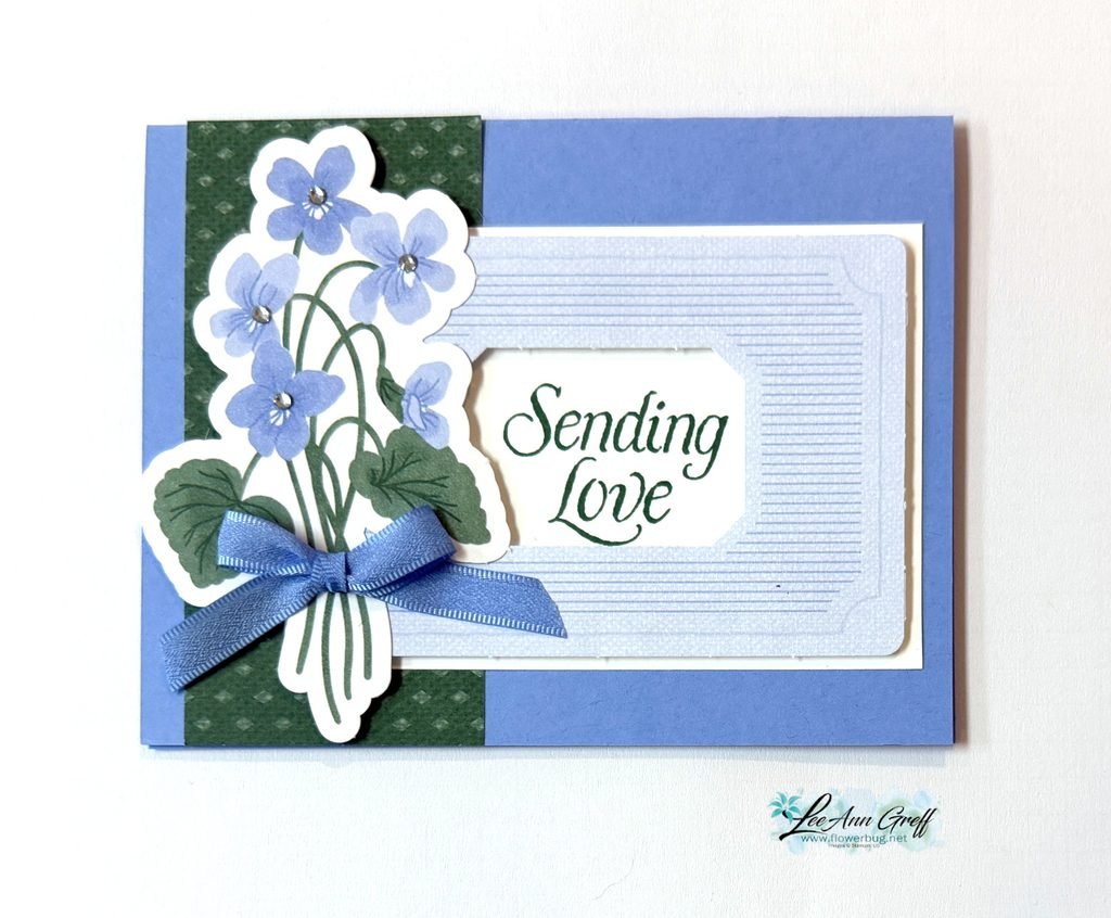
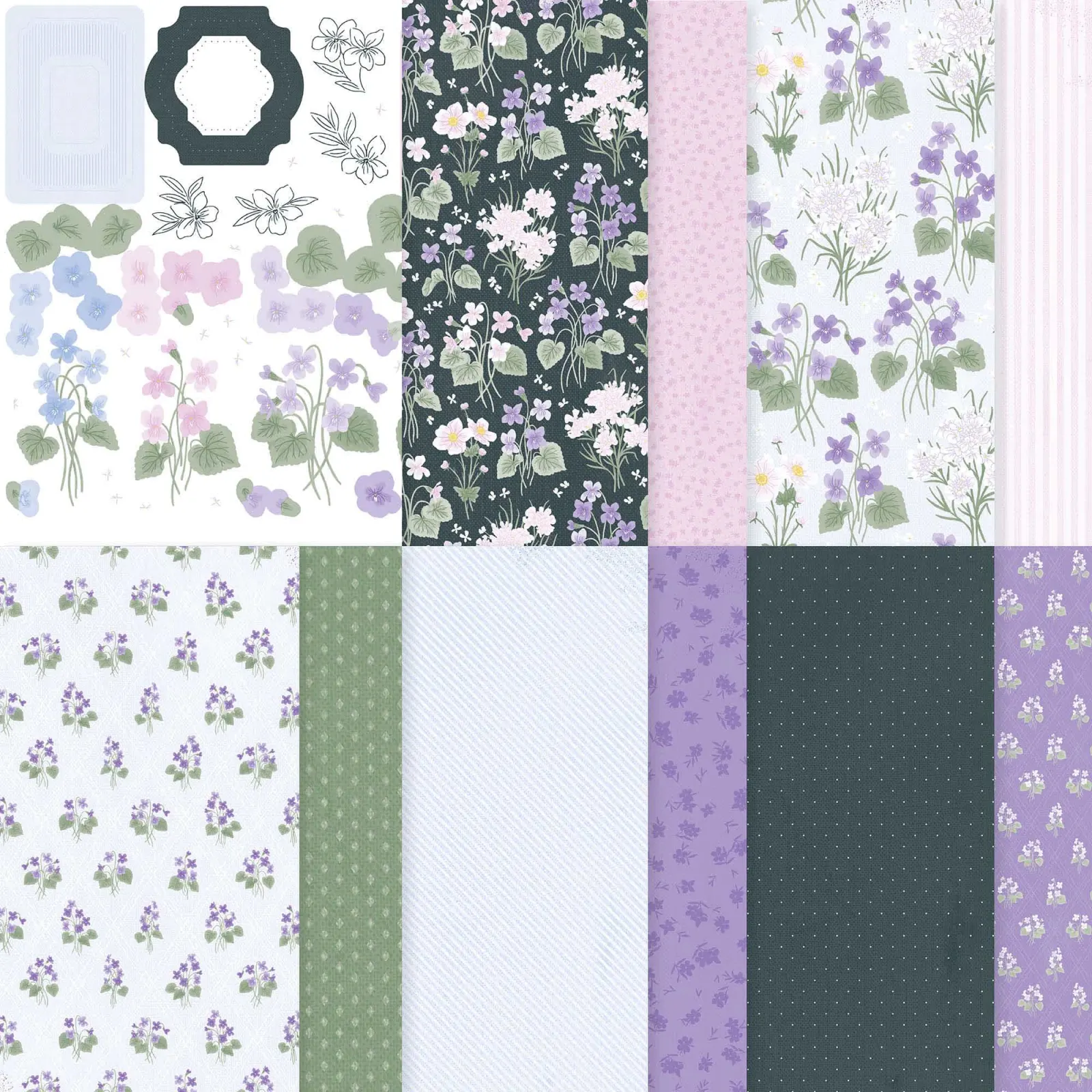
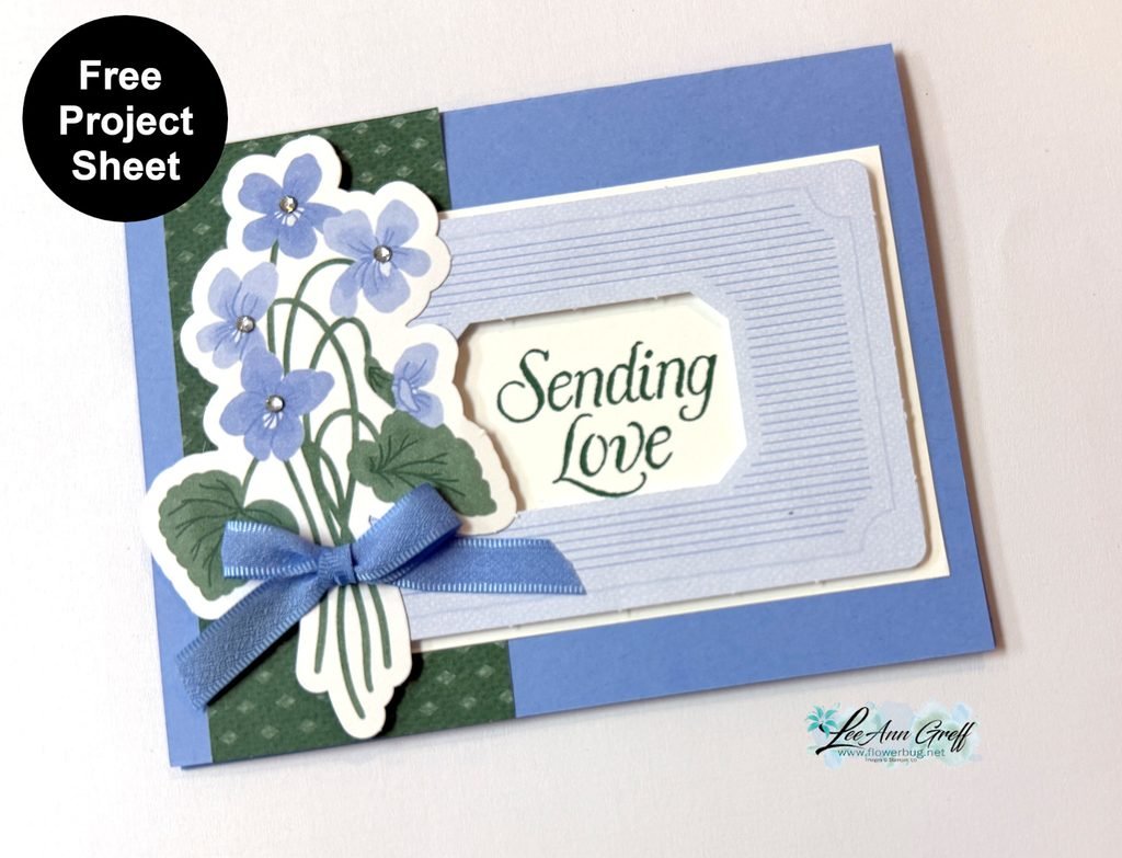
It showcases the pretty Violet Dreams DSP seen here. There are 3 pieces from the DSP on this card: the violets die-cut, the striped frame and the green DSP strip. This DSP has 2 sheets of die-cut ephemera included in the package. I love that; it opens up so many options when creating.
Look closely at the coordinating colors on this card. Stampin’ Up! makes it so easy to create with perfectly matching colors. It’s my very favorite thing about SU. I used the violets as the starting point and simply repeated each color once or twice on my project for a wonderfully cohesive look.
Tip: If you struggle with color coordination pick two colors and repeat them at least once if not twice on your project. This works!
Check out the video below where I shared on more pretty card featuring DSP strips.
All Posts
Growth Takes Time with Radiating Stitches dies; & free project sheet!
On last week's FB Live I shared three cards featuring the new Online Exclusive products. A few are already out of stock but they are ordering more. You can see them all here.
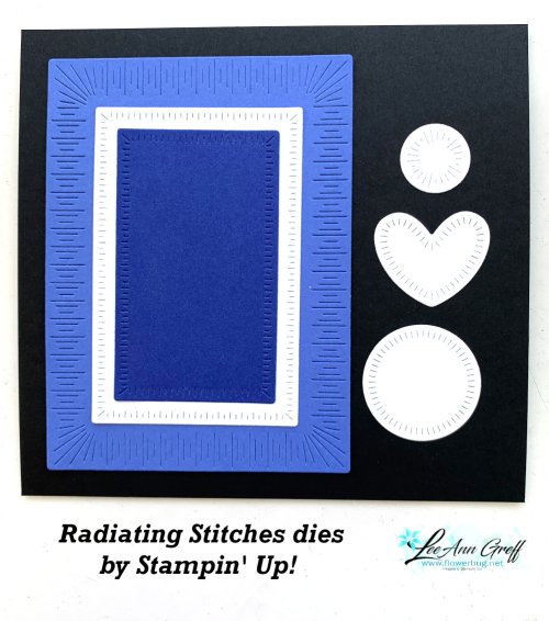
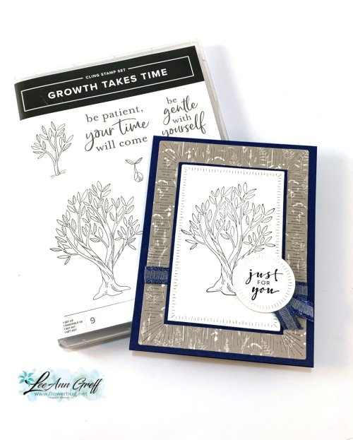
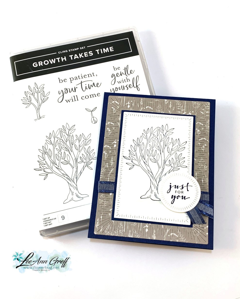
Today's project features two of them. Radiating Stitches dies and Growth Takes Time stamp set.
I stamped the tree and greeting (Charming Sentiments) using Night of Navy ink. I did not color in the tree; sometimes it's okay to keep it simple. The ribbon here is the Navy bordered ribbon in the Spring catalog; seen here. It's soft and easy to work with.
I used three of the Radiating Stitches dies on this card. See them here.
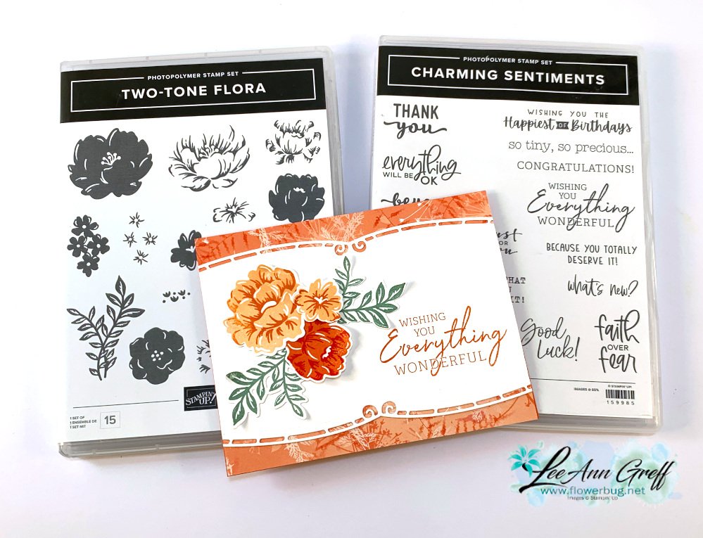
Two-Tone Flora with Elegant Borders dies & a FREE project sheet!
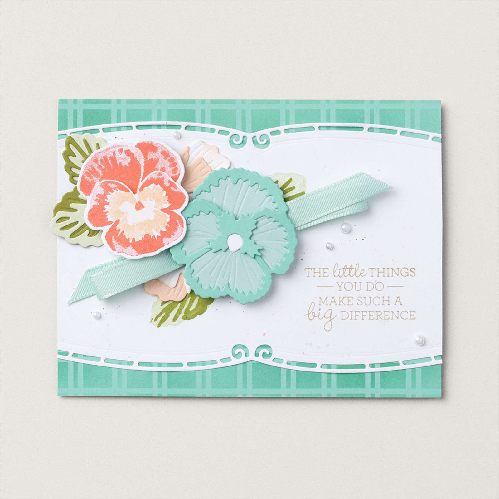
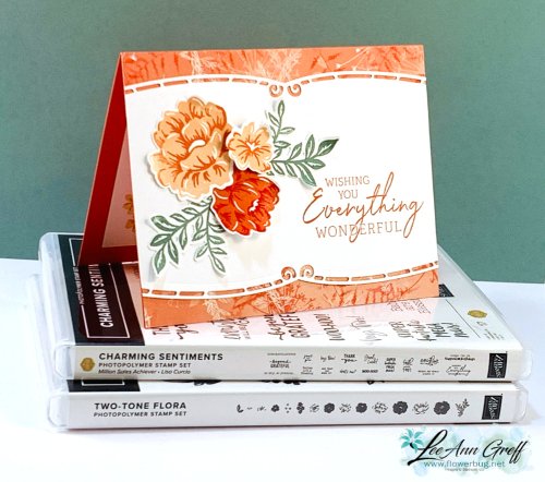
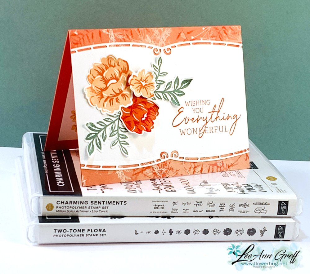
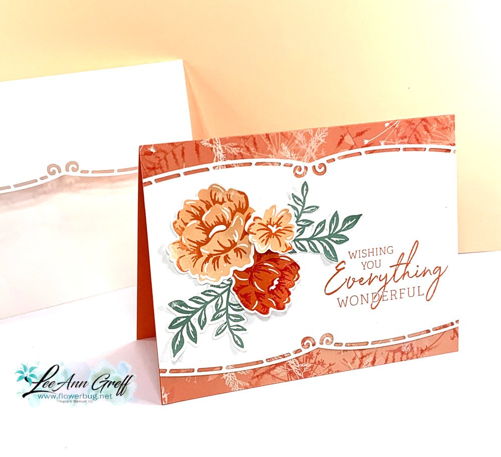
In preparing my make & takes for my March Team meeting I knew I wanted to focus on the new Online Exclusives. I looked at the samples online for the Elegant Borders dies seen here and found this card made by Stampin' Up!'s artists:
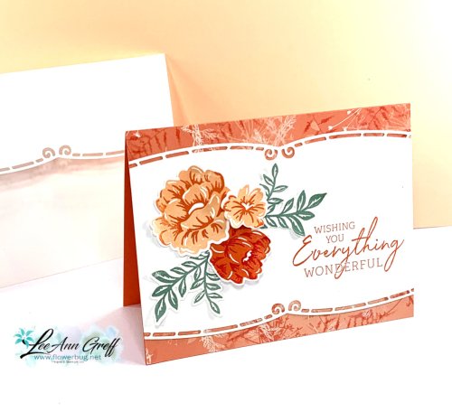
Using samples from our printed catalog or online store can make stamping easier. Use a layout, technique or color combo as your inspiration. My colors include Calypso Coral, Petal Pink, Soft Succulents and Poppy Parade.
Isn't that elegant border die gorgeous?! I also used to for the envelope flap edge. See the Elegant Border dies here.
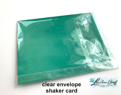
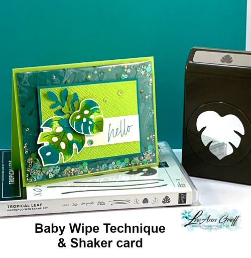
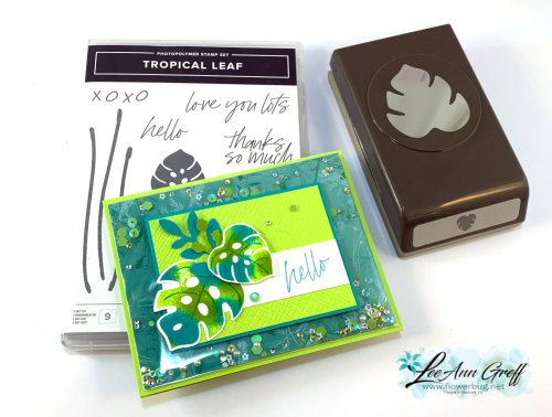
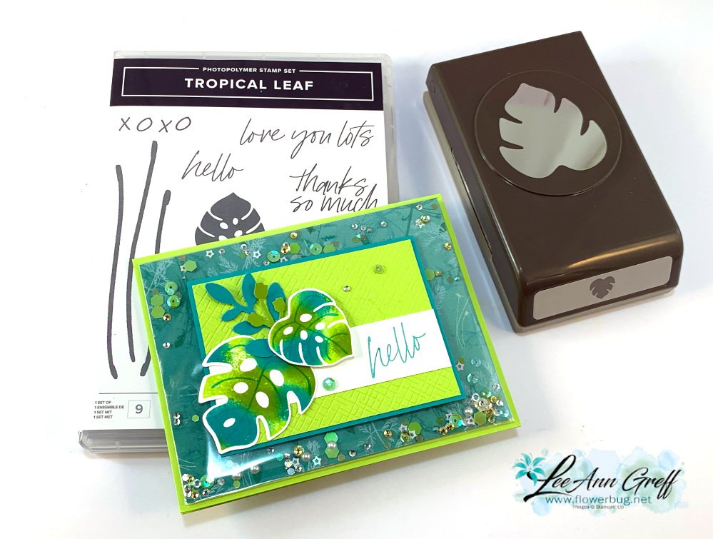
The colors include Parakeet Party, Bermuda Bay and a tiny bit of Granny Apple Green. The designer paper inside the clear envelope is Pretty Prints. Here's how I created the clear envelope shaker:
My Pretty Prints designer paper layer is 5 1/4" X 4" and our clear envelopes are about 1/2" larger. For the shaker elements to stay on the front side of the envelope it has to be tight and smaller. So I added tear & tape to the back edge and folded the extra over tightly. Now, insert your shaker elements on the front pocket and fold down the end flap. Wallah! You have a shaker card front!
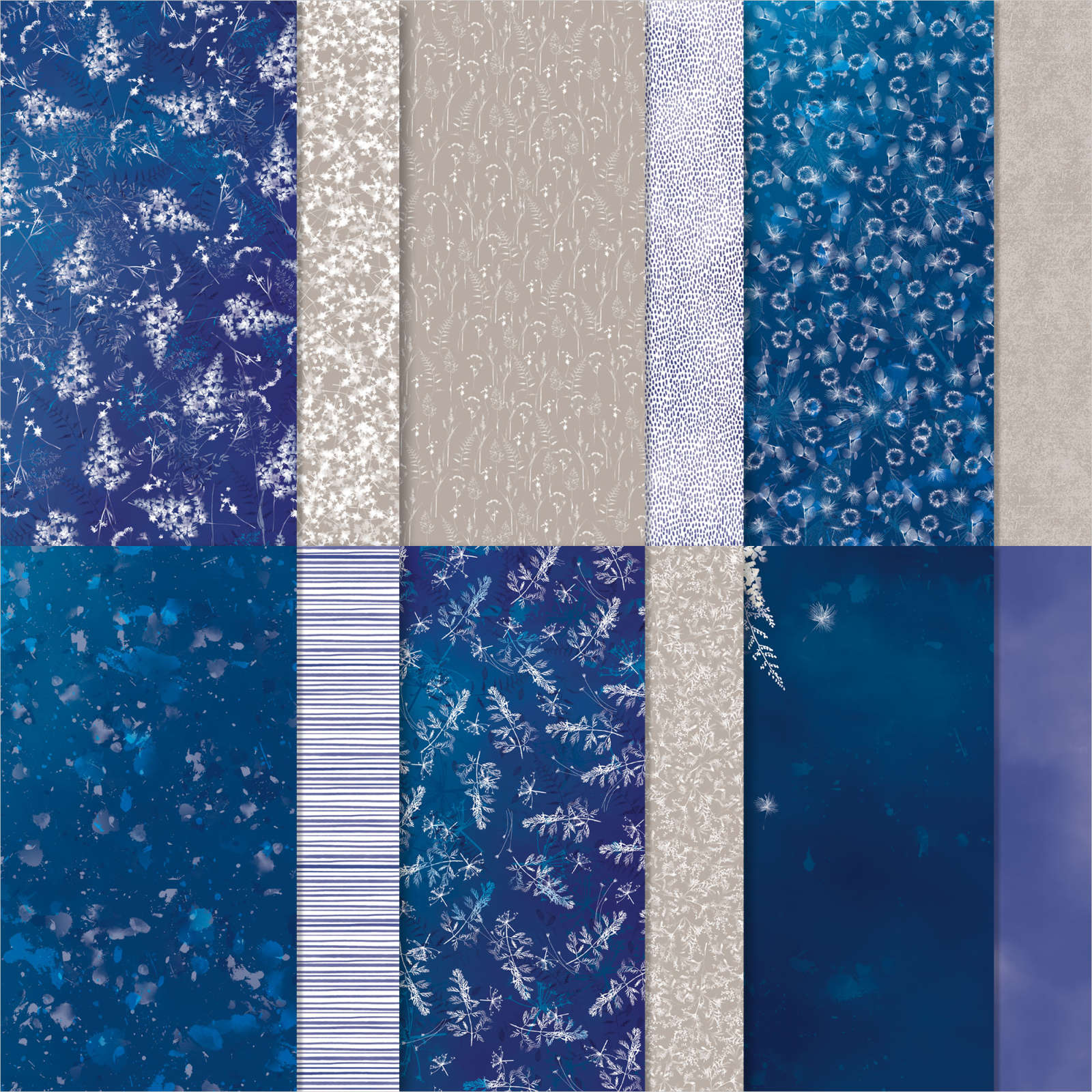
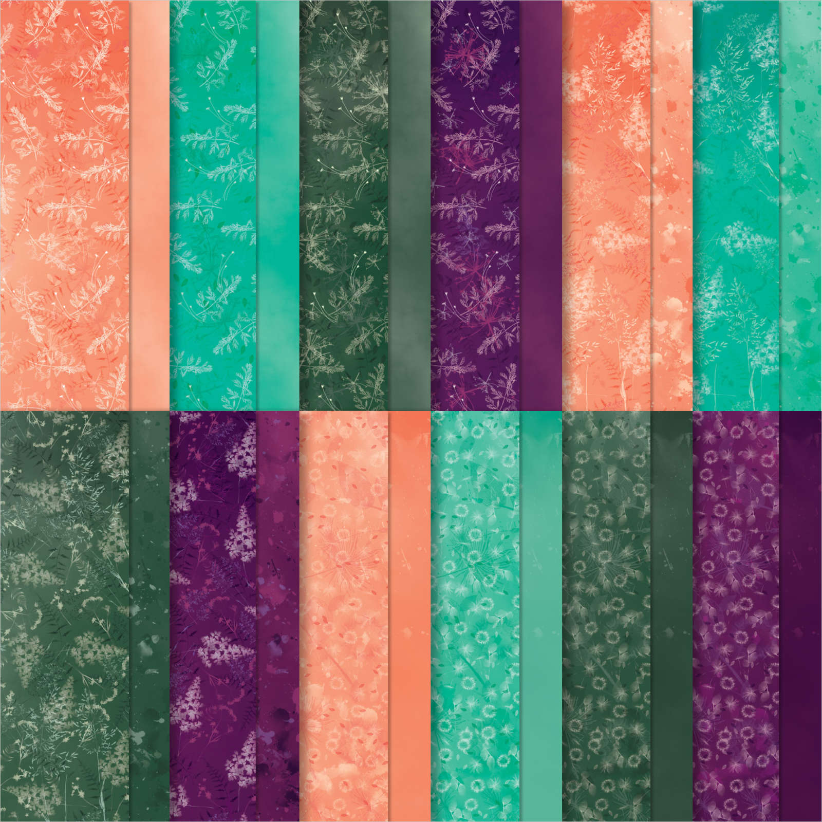
This DSP is from the Pretty Prints; soon to retire from the Annual catalog. See it here.
It includes some of my favorite colors – Bermuda Bay, Blackberry Bliss, Calypso Coral and Evening Evergreen.
The CS layers on the front are added on top of this shaker element so you still get the feel of a real card; not all slippery. Watch the video here or below to see how it's done. It's the 2nd project of 3.
Notice: LeeAnn Greff, Independent Stampin’ Up! Demonstrator, Manager. The content of this website is my sole responsibility as an independent Stampin’ Up! demonstrator and the use of, and content of, the classes, services, or products offered on this website is not endorsed by Stampin’ Up! Copyright 2025





















Leave a Reply