/


Latest Post

Understanding Color Theory (the Color Wheel) with video


If choosing color combinations is challenging for you the Color Theory video below may help you out. 

You can find a printed color wheel in the new Annual Catalog on page 132.  Some of us lucky Demo's received a real color wheel at OnStage in Houston.  It was a surprise perk for attendees. 

Stampin' Up! has heard from many people begging for one since they saw it. Stay tuned; they are producing another that will be available for purchase later this year.  In the meantime please watch the video seen further below to see how you can use this color wheel.

Here's a photo of the printed color wheel in the catalog: 

My top favorite and easiest way to combine colors is Monochromatic. This means hues of one color – blues, greens etc.  Monochromatic projects are soothing to the eye and can be seamless.  

My second favorite is to use complimentary colors such as pink & green or yellow with purple. 

If you're using designer paper Stampin' Up! has done the work for you – just choose from the colors listed on the back of each package. 

Honestly, how I usually choose colors is to hold the card stock pieces next to each other. For me that's easy, but I know others struggle so I hope the video below will help you out.  

~~~

May Specials: 

*current host code link:  D6QRFZ7J or FCJ937QT

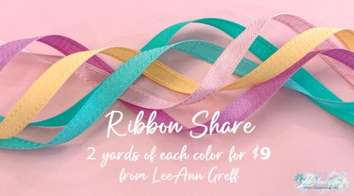
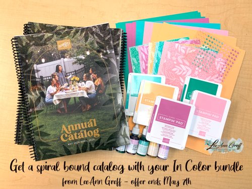
Click on the pictures above or below to get to my new catalog shares – choose from designer papers, In Color bundles or a ribbon share. They're available through May 7th only. 
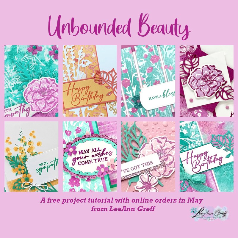
All online orders in May will receive a free multi-project tutorial and a share of !
All Posts

  • Striking and fun Black Magic technique with video!


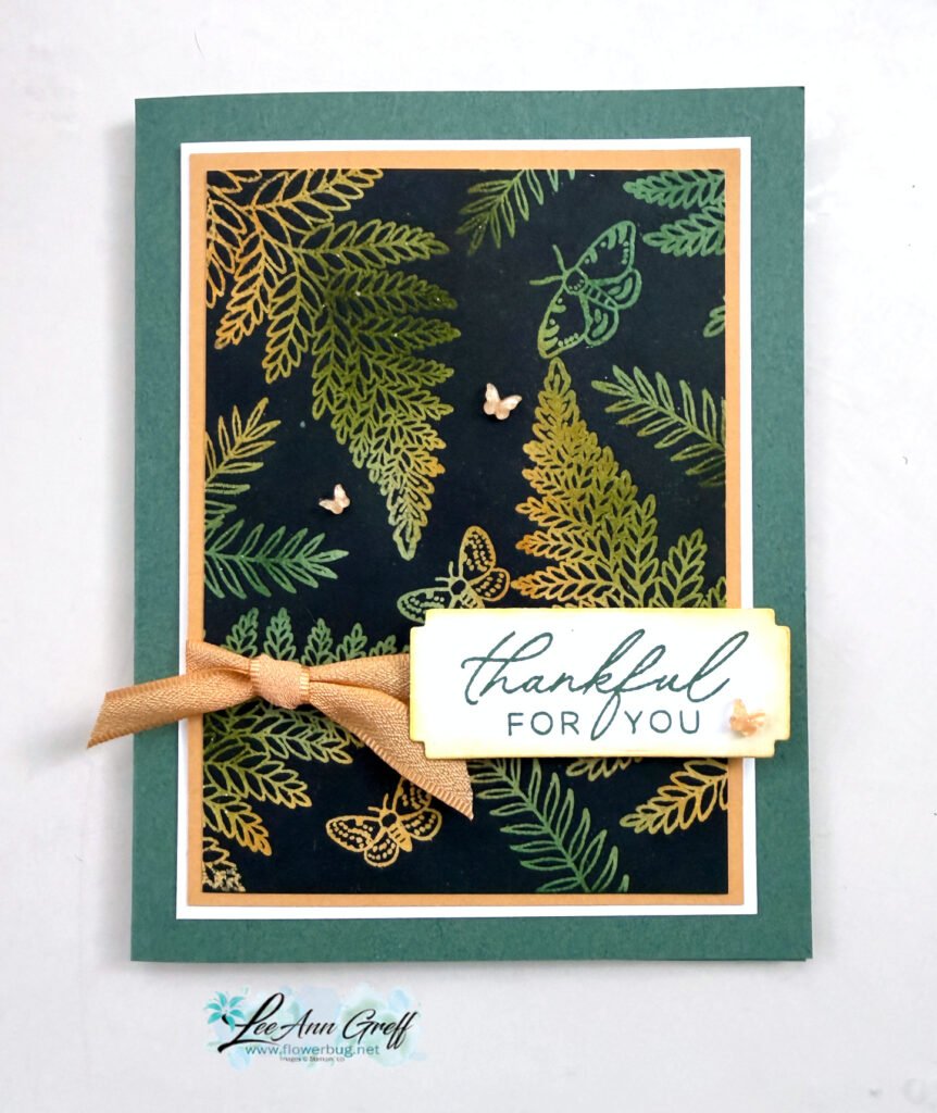
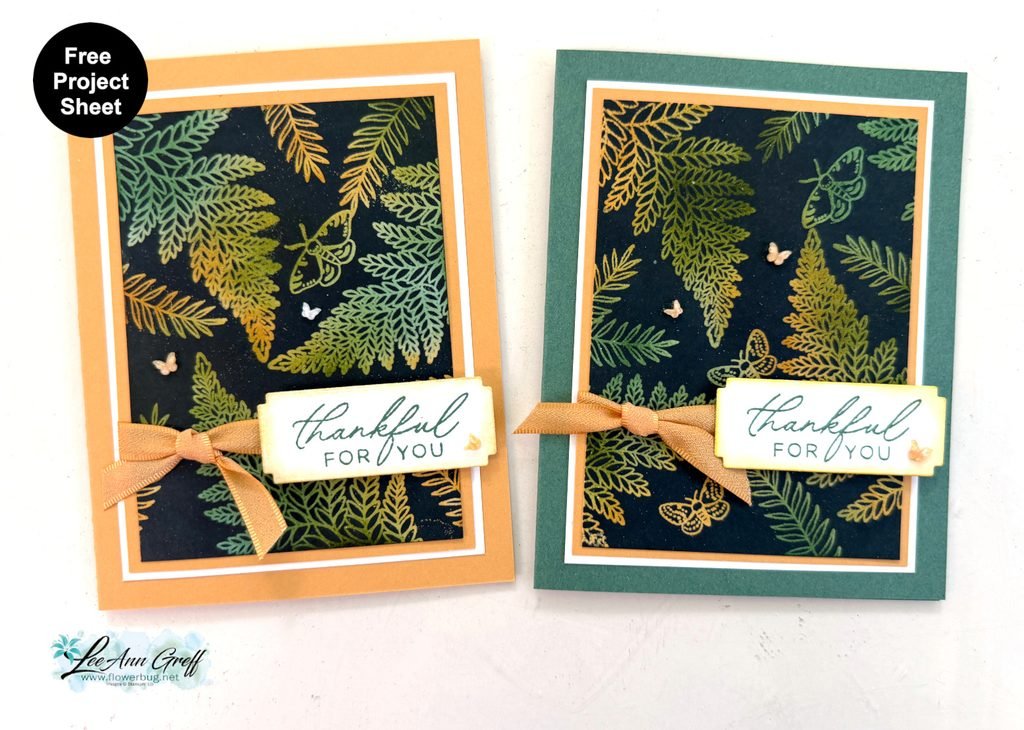
    I shared this pretty card on last week’s Live video. It’s the Black Magic technique!

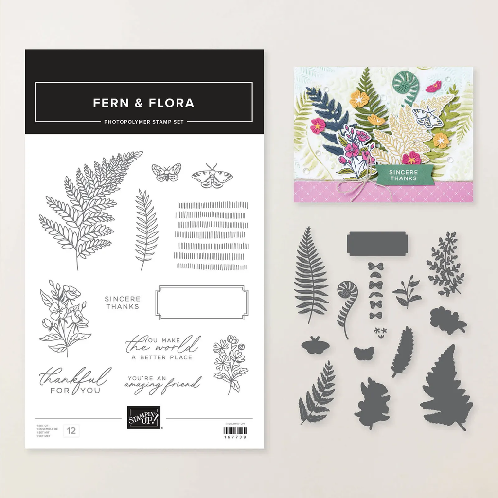
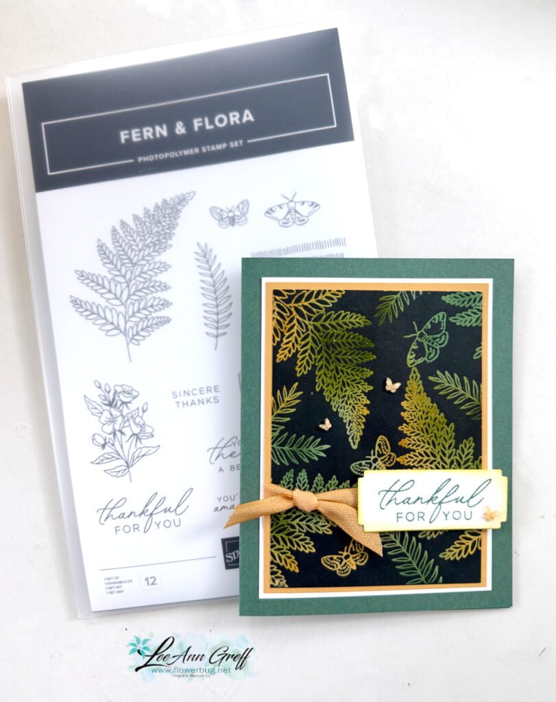
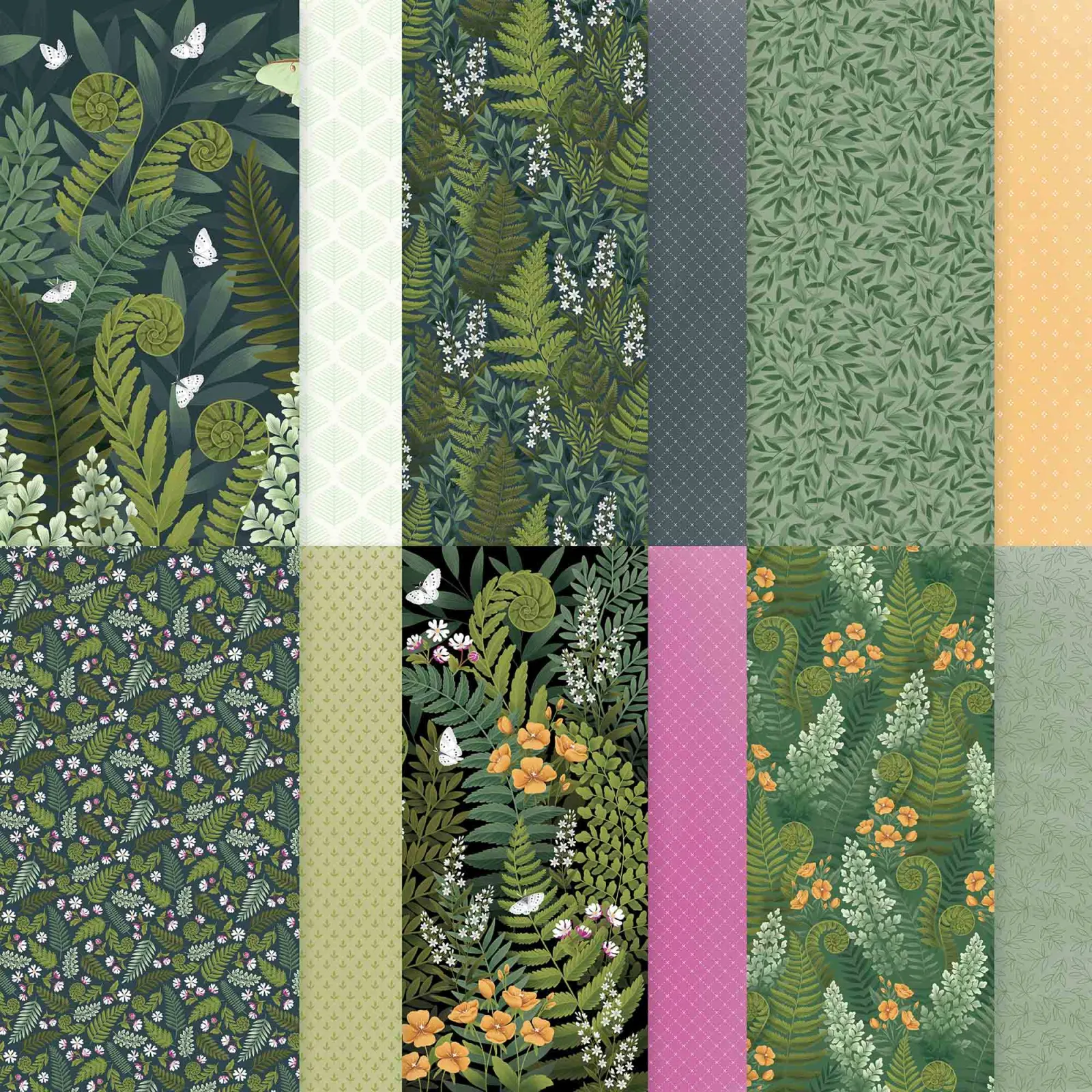
    My colors include Peaceful Pine, Old Olive (ink only), Golden Glow and White. It features the Fern & Flora bundle seen here.

    What is the Black Magic technique? It’s where you start with a light neutral piece of card stock and add color with sponges or markers. Then stamp images in Versamark and heat emboss with clear embossing powder. The magic happens when you cover it completely with a water based ink (here I used Secret Sea). Then wipe off the ink that does not ‘stick’ to the heat embossed areas. True magic!

    Watch my video tutorial further below to see this technique in action.

    On this card I used mostly the stamp images; only the greeting die-cut is from the dies. I added a few In Color butterfly gems and the pretty Golden Glow ribbon too.

    I created a free project sheet for this card; click here to download it or to print it.

    I made one with Golden Glow as the card base and the other as Peaceful Pine as the card base.

    Below is the video tutorial for this card and another.

    Leave a Reply

    Your email address will not be published. Required fields are marked *

  • Pretty Fern & Flora card; with free project sheet & video tutorial


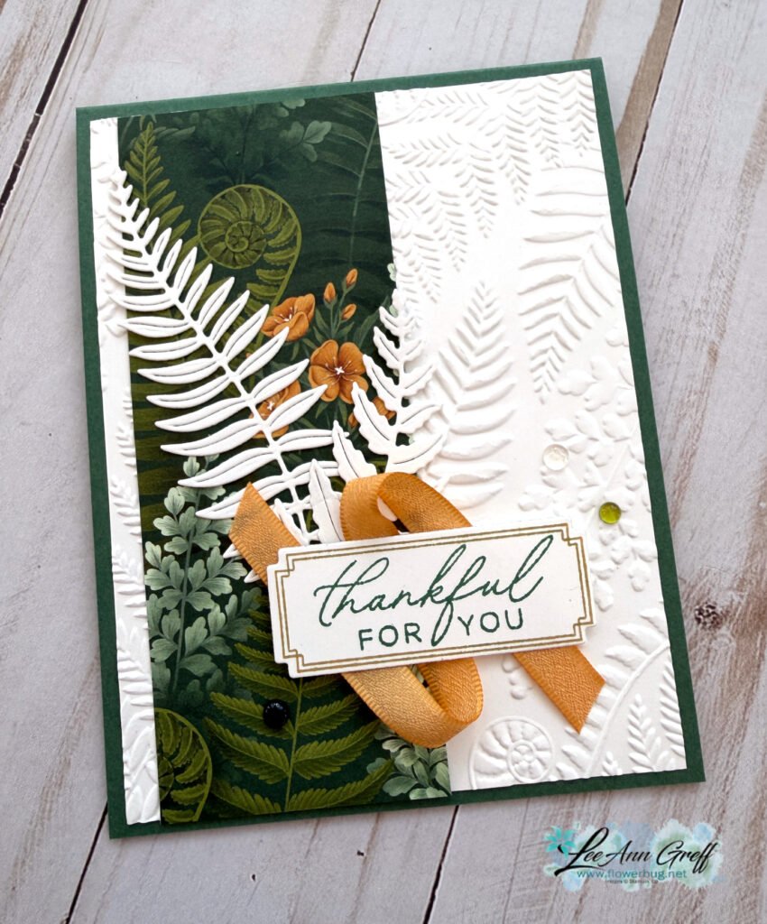
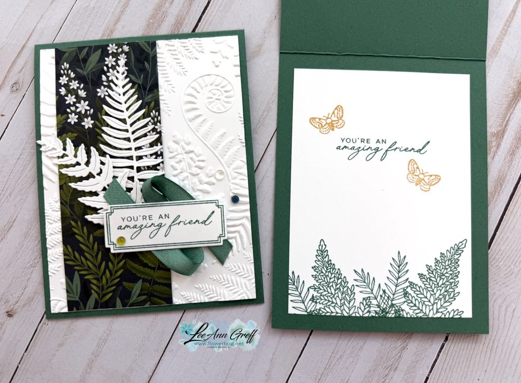
    There’s something about crisp white on a card. It gives a feeling of elegance to your projects.

    This card features the Fern & Flora bundle seen here. The designer paper is called Moonlit Flora and the embossing folder is called Fern & Flora and can be seen here. Unfortunately the Designer paper AND the embossing folder are out of stock right now. Very popular products!

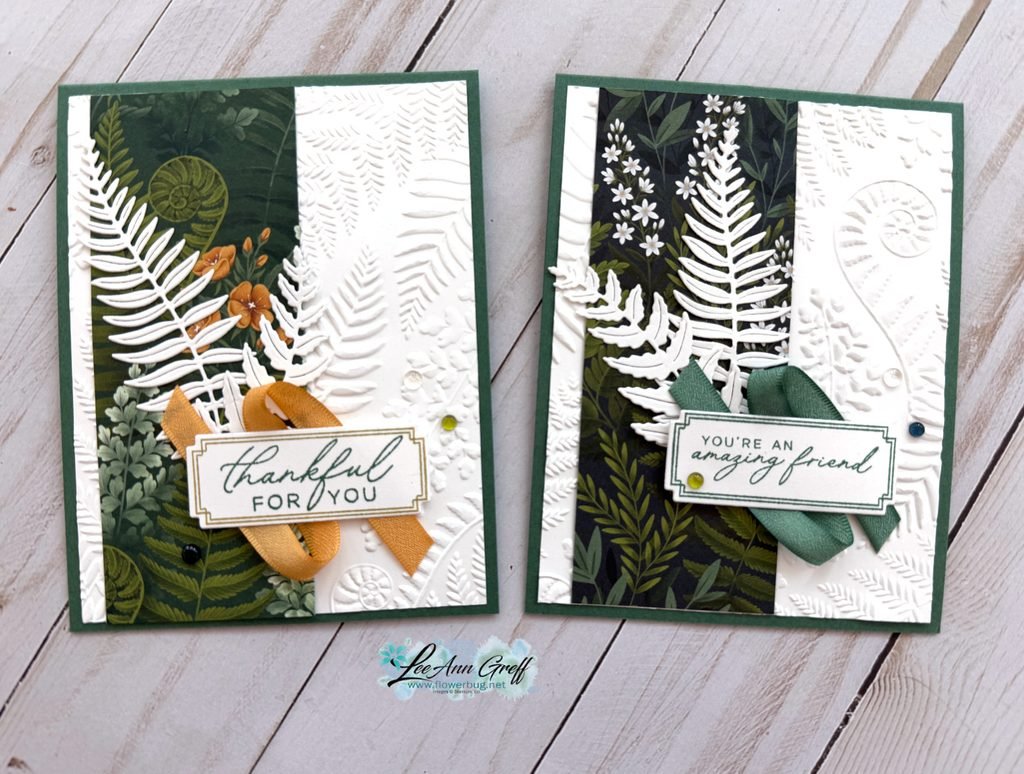
    I took a little creative license and added White fern die-cuts here. I love the way they show up against the Moonlit Flora designer paper strip.

    The colors include Peaceful Pine, with White and the new Golden Glow in color.

    Which do you like better? All green and White on the upper right, or the pop of the additional Golden Glow?

    The pretty Moonlit Flora designer paper offers multiple patterns: See it here. Be sure to add your name to the product so you get an email when it’s back in stock.

    I created a free project sheet for this card. Click here to download it or print it.

    I also shared a video tutorial for this card and one more using this pretty bundle. Click on it below.

    Leave a Reply

    Your email address will not be published. Required fields are marked *

  • A fun way to use your Designer Paper scraps!


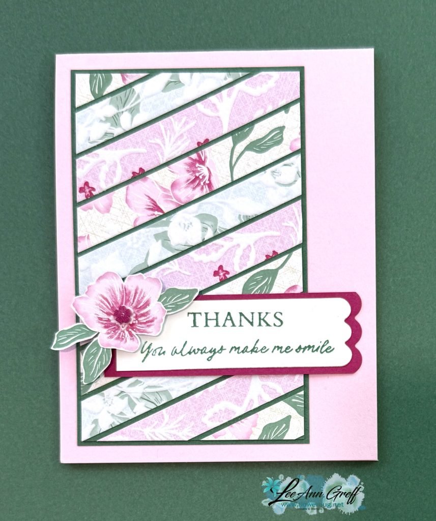
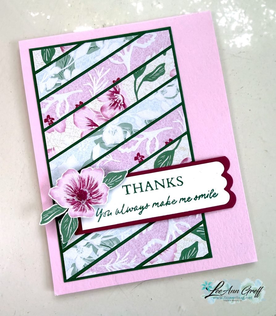
    Is it hard for you to toss those small pieces of designer paper pieces? Well, if you’re a ‘saver’ I have a quick card idea for you.

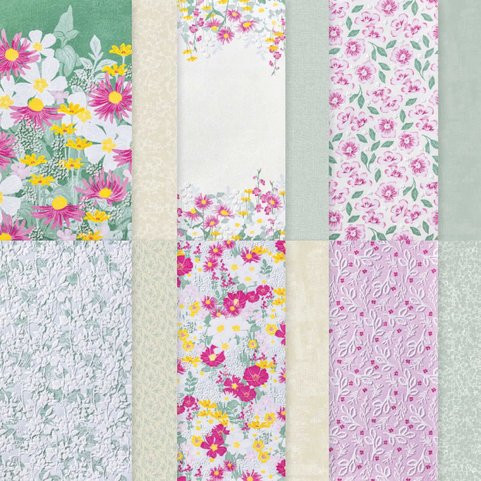
    Here I used the pretty Velvet Meadow specialty designer paper from our Online store. It has velvet/flocked accents that feel soft and fuzzy. See it here.

    Unfortunately it’s currently out of stock but it will be back! Add your email to the product page so you’re notified when it’s available.

    I cut three different patterns of DSP in 1/2″ wide strips. I added them to a piece of Peaceful Pine card stock (3″ X 4 3/4″) at an angle. I left a narrow space between them all and trimmed off the ends afterwards. Then I layered it on another Peaceful Pine piece slightly larger before adding it to my Bubble Bath card base.

    Tip: Adding the designer paper layer on the left and adding the greeting strip hanging off on the right adds balance to the card.

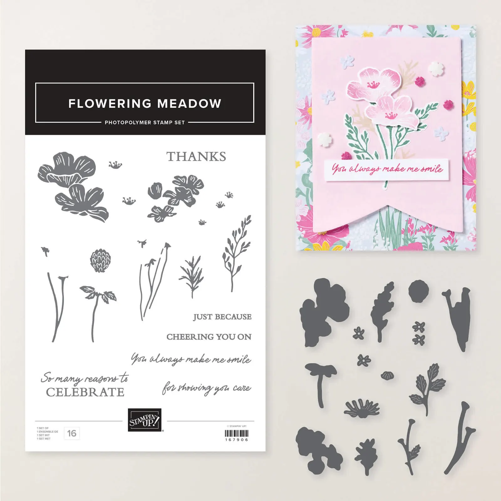
    Here’s the coordinating Flowering Meadow bundle; see it here.

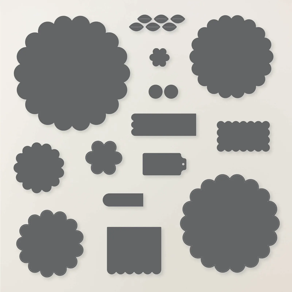
    The greeting is made with the Scalloped Blooms dies. The flower and leaves are fussy cut from the designer paper. A quick and pretty card!

    Leave a Reply

    Your email address will not be published. Required fields are marked *


Notice: LeeAnn Greff, Independent Stampin’ Up! Demonstrator, Manager. The content of this website is my sole responsibility as an independent Stampin’ Up! demonstrator and the use of, and content of, the classes, services, or products offered on this website is not endorsed by Stampin’ Up! Copyright 2025