/


Latest Post

Check out this ‘Tackle box’ with the Gone Fishing bundle! Amazing!!


Today I'm sharing the last projects Candace made with the Gone Fishing and Let's Go Fishing designer paper.  She was our Artist of the Month for June and created some incredible projects!  

I was blown away by this 'tackle box' full of candy.  She told me she made it up herself!  AMAZING!! 
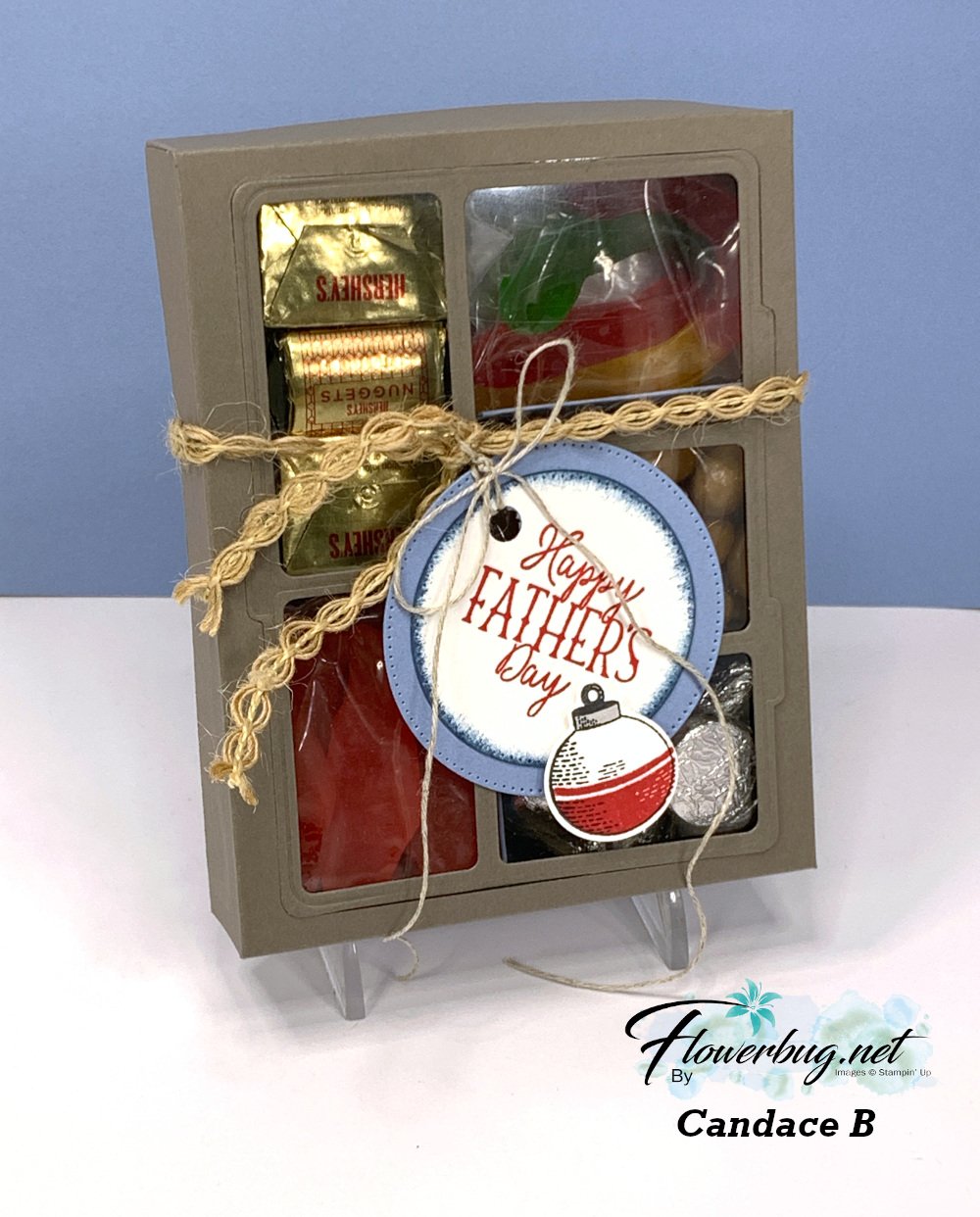
She added gummy fish & worms, kisses, candy 'rocks' and nuggets inside.  I believe she first scored her box front then used the Gone Fishing large die to cut the windows for the front panel. Scoring first would help you center the die. Then she added the window sheet to the underside.  The window sheet holds the die-cut frame and the box front in place. 

Measurements for the box: *corrected

  • top of box 6 1/4 X 7 1/2" score 1" on all sides
  • bottom of box 6 1/8" X 7 3/8" score at 1" on all sides
  • window sheet 4 1/8" X 5 1/4" 
  • left inside divider (two compartments) is 1 7/8" X 6 3/4" score at 2 3/4", 3 1/2" & 4 1/4" 
  • right inside divider (three compartments) is 2 1/8" X  8 1/4" scored at 2", 2 3/4", 3 1/2", 5 1/8", 5 7/8" & 6 5/8" 
  • inside bottom (under the two divided sections) 5 1/4" X 5 5/8" score at 1 7/8", 2 5/8" & 3 3/8"

To assemble this you'd add the long vertical divided piece first and then the two scored strips after that.  

I made a birthday version of this box. You can watch the video here.  

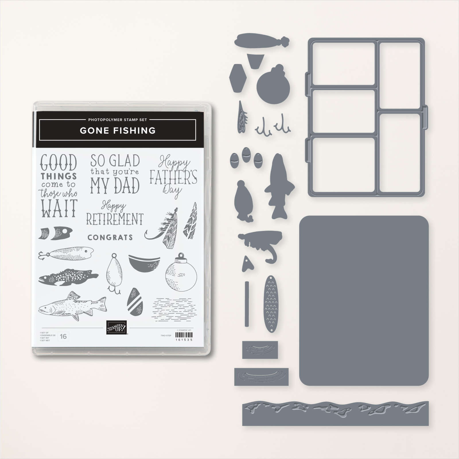
You can see the Gone Fishing bundle here. 
This last card is another fun fold; she made lots of them in her array of cards.  

It's a pocket card that could also include a gift card inside it. Be sure to note the rhinestone 'fish bubbles' on the sentiment.  


I love the wavy detail she added to the inside piece; it's from the Gone Fishing dies.

Measurements:

  • Misty Moonlight card base 5 1/2" X 8 1/2" scored at 2 3/4" & 6 3/4"
  • DSP 5 1/4" X 2 1/2" for front, bottom layer is 5 1/4" X 1"
  • Vanilla inside pull-out is 4 1/2" X 3 1/2"

And last but certainly not least is this fabulous shaker card:
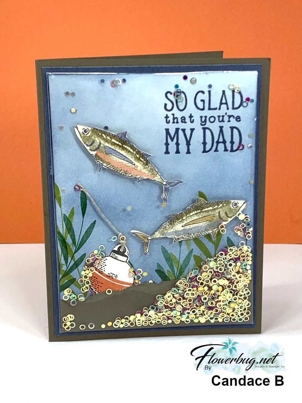

It's hard to tell but the colored and stamped panel is placed in one of our clear envelopes so she could add the new Iridescent shaker circles seen here. She added Boho Blue ink to the neutral card front using a Blending Brush, then stamped the greeting and leaves. She also fussy cut the fish from the Let's Go Fishing designer series paper and added them with Dimensionals. Then came the torn card stock layer and the bobbin and linen thread. 

Now she placed the entire piece inside a clear envelope, folded over the excess and secured it with adhesive. Now she added the shaker circles from the top open edge before closing it off to seal.  Add it to your card base layers and you're done! 

You can see these clear envelopes here.  I use them for card swaps, storing & protecting my finished cards and of course for easy shaker cards. They're $7 for 50 envelopes! 

This is such a fun card to make AND receive! It's hard to stop shaking it! 

~~~

July Specials: 

Bonus Days!

Get a $5 coupon for each $50 order you place in July.  Use the coupon in August!

2. PAPER PUMPKIN 48-HOUR SALE!

3. Next is a Clearance Rack update!

See all items available here

4. NEW Online Exclusives will be available

See them all here

~~~

Plus my monthly special for online orders:

Get a free card kit & a new Beautifully Happy stamp set 

with online orders over $65; must use a host code.

*current host codes: BKEARDMW or GGDRKFQR

All Posts

  • Inked & Tiled with a gorgeous background with video & blending tips!


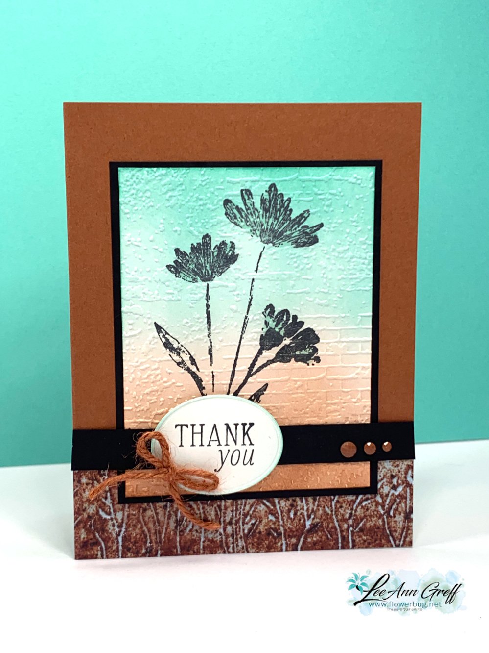
    Today I'm sharing one of my favorite cards I've made this month. These colors are so me!  I needed to make 28 of these for the Norway cruise with Stampin' Up! We have to option of joining a card swap and I always try to do something unique for this special swap. 

    I chose the new Copper Clay with Black and Coastal Cabana. Aren't they beautiful together? 

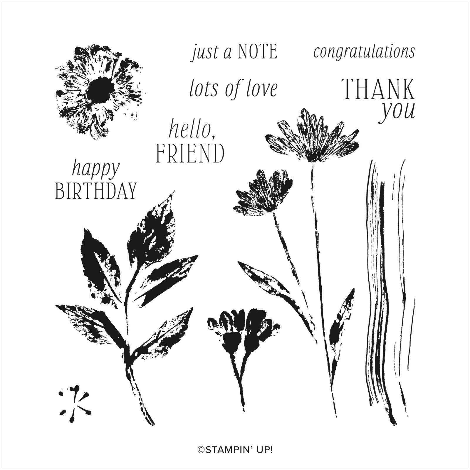
    This card features the new Inked & Tiled stamp set seen here. It actually comes in a bundle with two punches. But I didn't use those here.  

    After I stamped the flowers in Black ink I used Blending Brushes to add both Coastal Cabana and Copper Clay ink.  We have both regular and small Blending Brushes now.  For a background like this I recommend the larger set of brushes. See them here.

    Tip: when wanting a smooth blend, I recommend adding ink to your brush and start off of your paper. Slowly work your way on with a soft, gentle swirling motion. Adding pressure can give you blotches or other marks.  It's also helpful to have a fully inked pad.  *Remember that is helps to add ink a little at a time. It can be a slow process! 


    Isn't that texture gorgeous with the blended background?!  

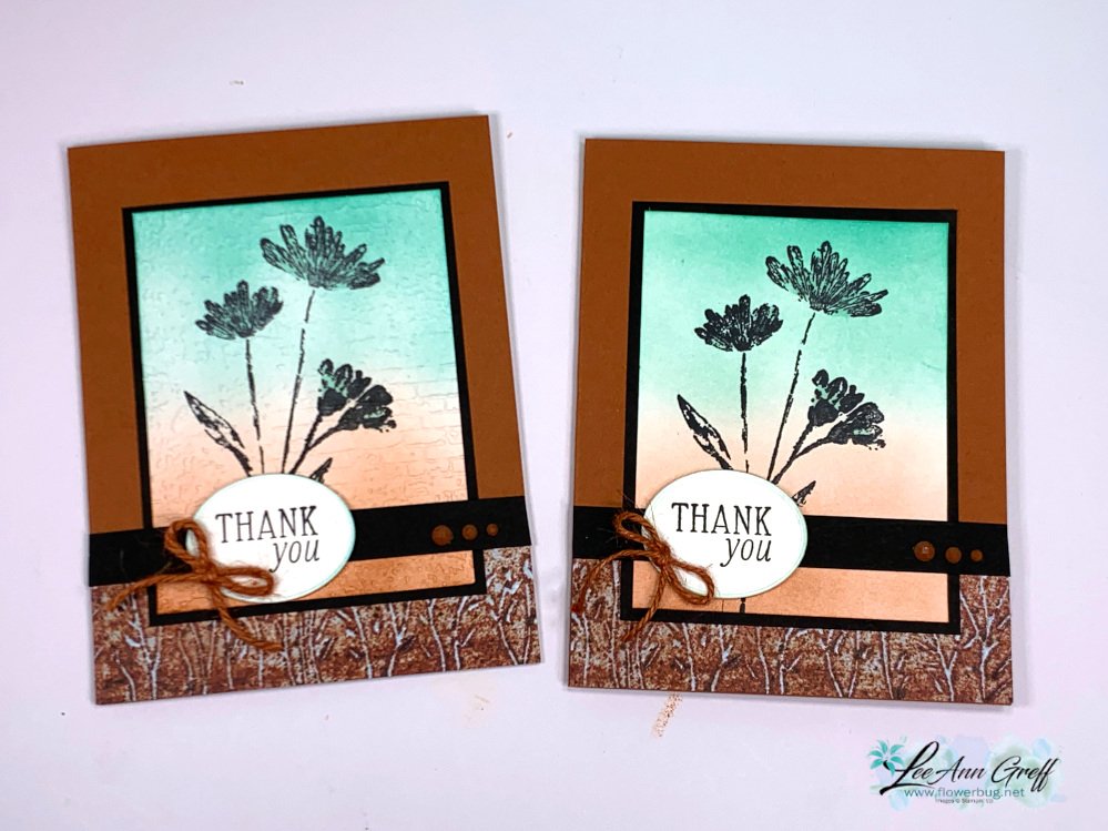
    When I was creating this card I made the card on the right first.  If you look closely the stamped panel does not have any texture on it.  Adding the Exposed Brick embossing created the perfect finish!  


    In the video I share two other beautiful cards made with the Inked & Tiled stamp set.  

    You can watch me make this card on the video here. Or click on the photo below to watch. 

    ~~~

    May Specials:

    *current host codes: ZHZ6CPYU or AJVB3B3V 

    Get a free updated cardstock color sampler with online orders over $55 using a host code.

    Offer good while supplies last:  

    I have one spot left in my new catalog designer paper share. 

    Get 80 sheets of 6 X 6" DSP – all from the new catalog for just $28.50 plus shipping.  Reserve your spot here. 

    Earn free products with my loyalty rewards! 

    Click here to download yours and earn a $50 shopping spree!

    Leave a Reply

    Your email address will not be published. Required fields are marked *

  • Fresh, new color combination with Inked &Tiled – fun fold with video tutorial too


    I've been working double time getting ready to leave for our Norway cruise – this year's incentive trip with Stampin' Up!  I'm thrilled to go on this year's trip with my husband.  He's a fabulous traveling partner! 

    Depending on WIFI, I hope to share photos on Facebook and Instagram while we're gone.

    "Fewer than 1% of Stampin’ Up!’s demonstrators worldwide achieve this trip."

    ~~~  

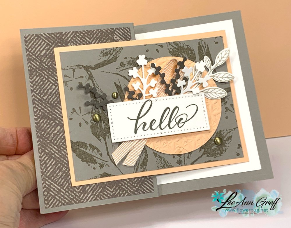
    I'm not usually a Subtles or Neutrals kind of gal but I sure love this beautiful color combination!  It's Gray Granite, Petal Pink with a bit of our new Pebbled Path.  

    What do you think?  I haven't Gray Granite often because I never found a color to pair it with.  But Pebbled Path is gorgeous and among the same color tones. And add Petal Pink and it's beautiful!  

    I stamped the large leaf image repeatedly on the Gray Granite layer. The greeting is on a white die-cut from the Timeless Arrangements dies. I added a few of the pretty die-cuts under the greeting before layering a folded piece of ribbon (Ribbon Duo Combo Pack) and then to the punched & textured Petal Pink circle.  

    My card is an easy Z-fold – 4 1/4" X 11" card base scored at 2 3/4" and 5 1/2".  

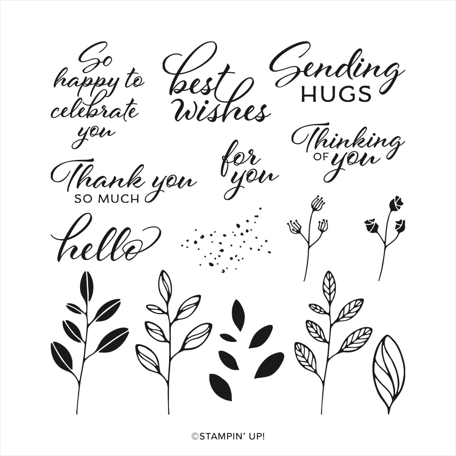
    I added lots of texture with the Timeless Arrangements dies.  The pretty 'Hello' greeting is from the new Layering Leaves stamp set. It's a new favorite and I LOVE that it matches the Bough punch!  See it here.

    Isn't it a beautiful set? 

    Measurements:

    • Card base 4 ¼” X 11” score at 2 ¾” & 5 ½”
    • Earthen Elegance DSP front 2 ¾” X 4”
    • Gray Granite 4” X 3”
    • Petal Pink 3 ¼” X 4 ¼”,  circle 2 ¾”
    • White inside 5” X 3 ¾”

    You can watch me make this card on the video here. Or click on the photo below to watch. 

    ~~~

    May Specials:

    *current host codes: ZHZ6CPYU or AJVB3B3V 

    Get a free updated cardstock color sampler with online orders over $55 using a host code.
    Offer good while supplies last. 

    I have one spot left in my new catalog designer paper share.  

    Get 80 sheets of 6 X 6" DSP – all from the new catalog for just $28.50 plus shipping.  Reserve your spot here. 

    Earn free products with my loyalty rewards! 

    Click here to download yours and earn a $50 shopping spree!

    Leave a Reply

    Your email address will not be published. Required fields are marked *

  • Cheerful Daisies card; perfect for Springtime!


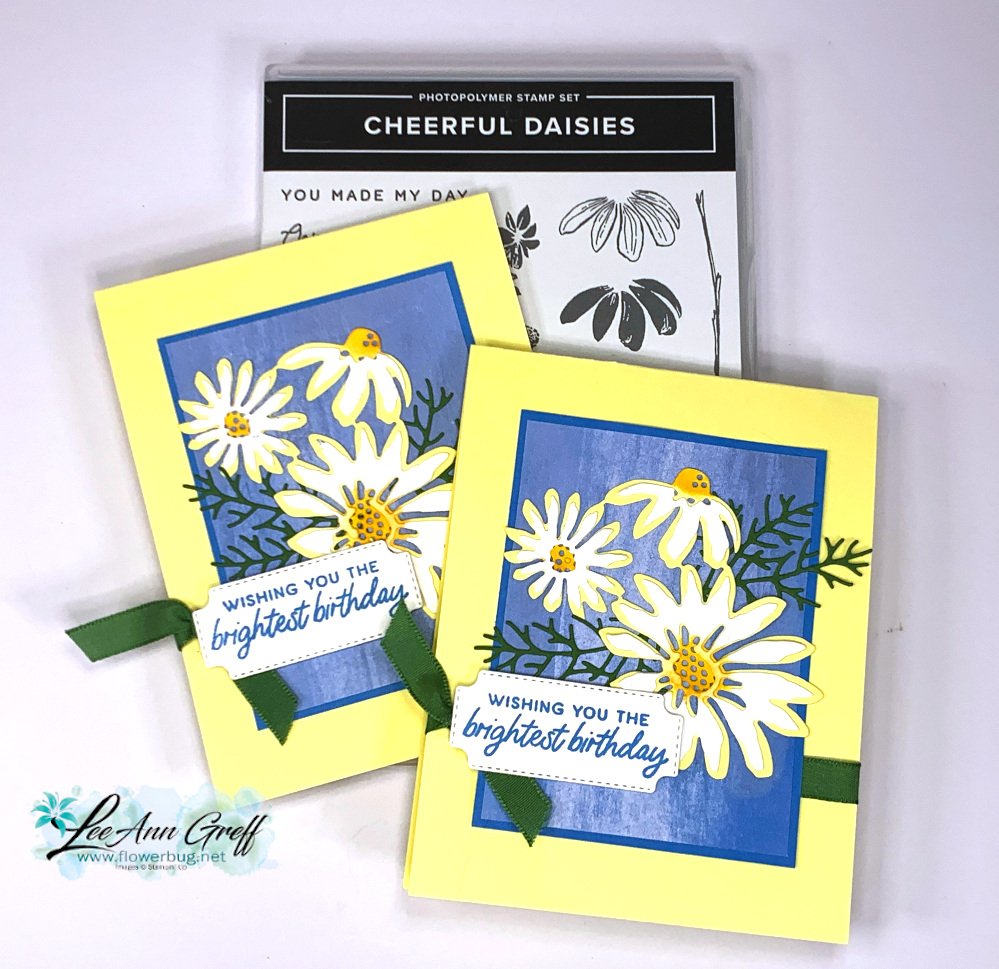
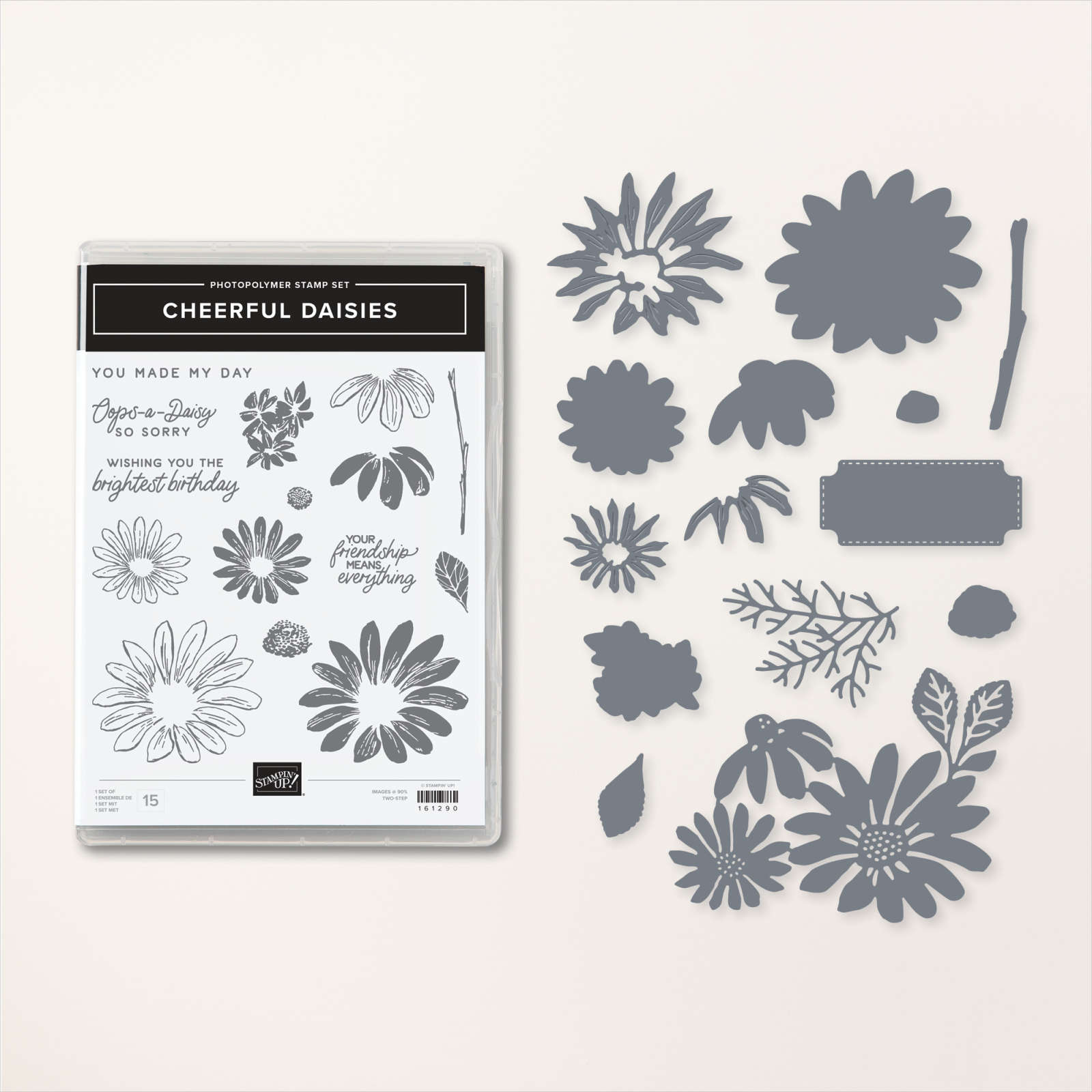
    I'm excited to share this pretty card with you. We made it at my May card clubs. It features the Cheerful Daisy bundle.  

    I absolutely love the colors!  I chose Lemon Lolly, Garden Green, white and the new Azure Afternoon.  I think the blue washed layer from the Fresh as a Daisy designer paper shows off the white & yellow daisies perfectly.  

    Here's how we finished the inside: 

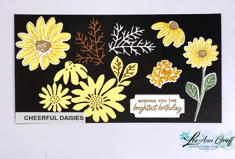
    I sponged extra yellow on the Lemon Lolly daisy centers before adding the White die-cut over them. Here's  a photo of the dies  display I made: I did not add the separate individual daisies that fir over the large yellow die-cut below.  On my card they're white.

    The ribbon wraps all around the card front and ties on the far left.  The greeting covers the knot so you see mostly the ends. 

    Check out that amazing, detailed greenery die-cut!  It even comes out of the die easily.  Love it!  


    See the Cheerful Daisies bundle here; I think it's wonderful!  Best daisy set we've had for awhile. 

    ~~~

    May Specials:

    *current host codes: ZHZ6CPYU or AJVB3B3V 

    Get a free updated cardstock color sampler with online orders over $55 using a host code.

    Offer good while supplies last. 

    I have two spots left in my new catalog designer paper share.  

    Get 80 sheets of 6 X 6" DSP – all from the new catalog for just $28.50 plus shipping.  Reserve your spot here. 

    Earn free products with my loyalty rewards! 

    Click here to download yours and earn a $50 shopping spree!

    Leave a Reply

    Your email address will not be published. Required fields are marked *


Notice: LeeAnn Greff, Independent Stampin’ Up! Demonstrator, Manager. The content of this website is my sole responsibility as an independent Stampin’ Up! demonstrator and the use of, and content of, the classes, services, or products offered on this website is not endorsed by Stampin’ Up! Copyright 2025