/


Latest Post

Check out this ‘Tackle box’ with the Gone Fishing bundle! Amazing!!


Today I'm sharing the last projects Candace made with the Gone Fishing and Let's Go Fishing designer paper.  She was our Artist of the Month for June and created some incredible projects!  

I was blown away by this 'tackle box' full of candy.  She told me she made it up herself!  AMAZING!! 
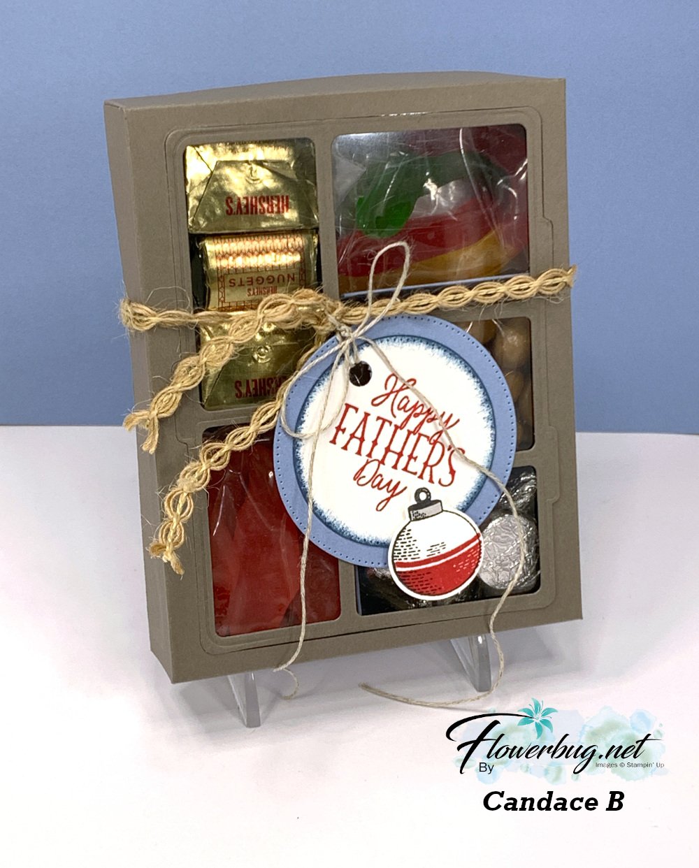
She added gummy fish & worms, kisses, candy 'rocks' and nuggets inside.  I believe she first scored her box front then used the Gone Fishing large die to cut the windows for the front panel. Scoring first would help you center the die. Then she added the window sheet to the underside.  The window sheet holds the die-cut frame and the box front in place. 

Measurements for the box: *corrected

  • top of box 6 1/4 X 7 1/2" score 1" on all sides
  • bottom of box 6 1/8" X 7 3/8" score at 1" on all sides
  • window sheet 4 1/8" X 5 1/4" 
  • left inside divider (two compartments) is 1 7/8" X 6 3/4" score at 2 3/4", 3 1/2" & 4 1/4" 
  • right inside divider (three compartments) is 2 1/8" X  8 1/4" scored at 2", 2 3/4", 3 1/2", 5 1/8", 5 7/8" & 6 5/8" 
  • inside bottom (under the two divided sections) 5 1/4" X 5 5/8" score at 1 7/8", 2 5/8" & 3 3/8"

To assemble this you'd add the long vertical divided piece first and then the two scored strips after that.  

I made a birthday version of this box. You can watch the video here.  

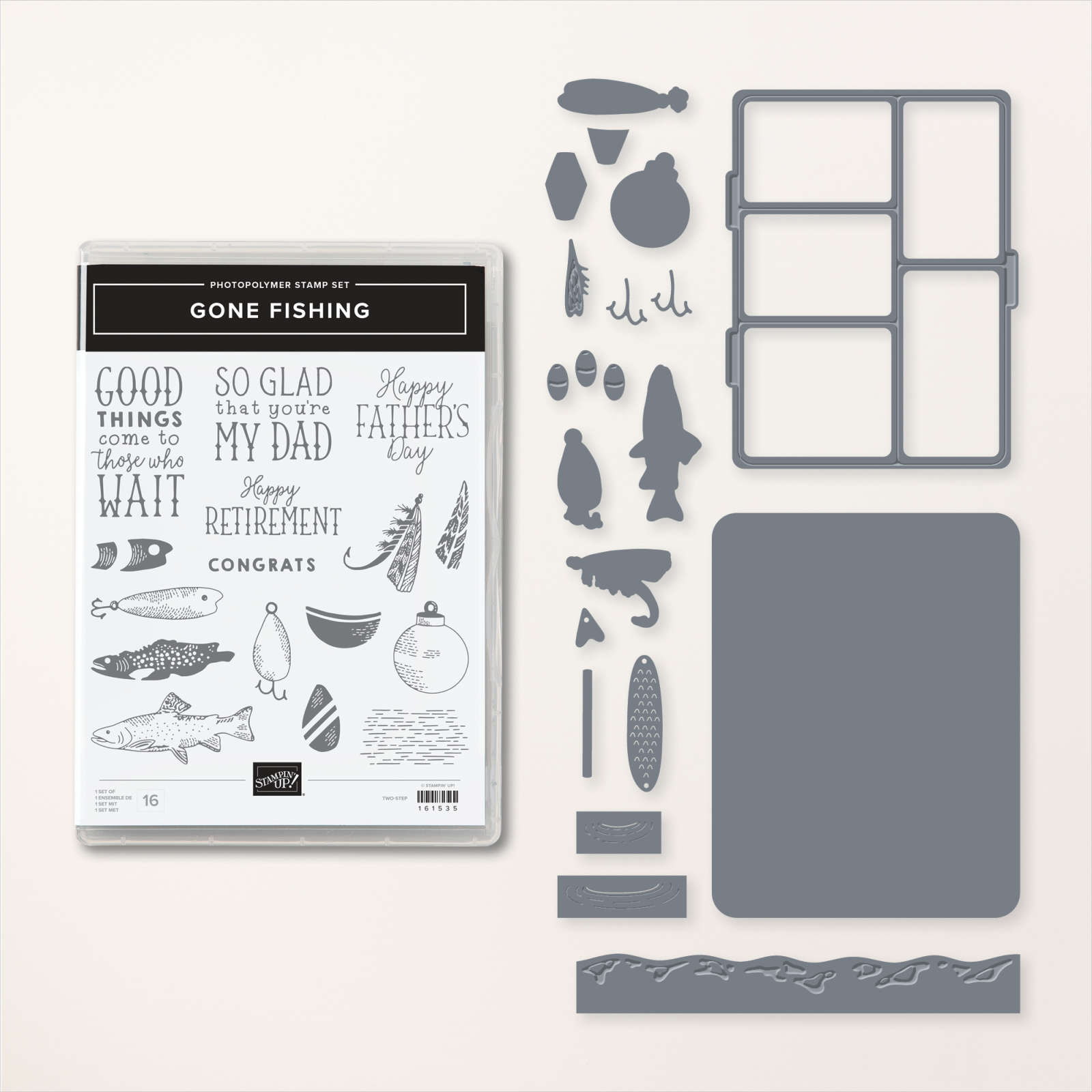
You can see the Gone Fishing bundle here. 
This last card is another fun fold; she made lots of them in her array of cards.  

It's a pocket card that could also include a gift card inside it. Be sure to note the rhinestone 'fish bubbles' on the sentiment.  


I love the wavy detail she added to the inside piece; it's from the Gone Fishing dies.

Measurements:

  • Misty Moonlight card base 5 1/2" X 8 1/2" scored at 2 3/4" & 6 3/4"
  • DSP 5 1/4" X 2 1/2" for front, bottom layer is 5 1/4" X 1"
  • Vanilla inside pull-out is 4 1/2" X 3 1/2"

And last but certainly not least is this fabulous shaker card:
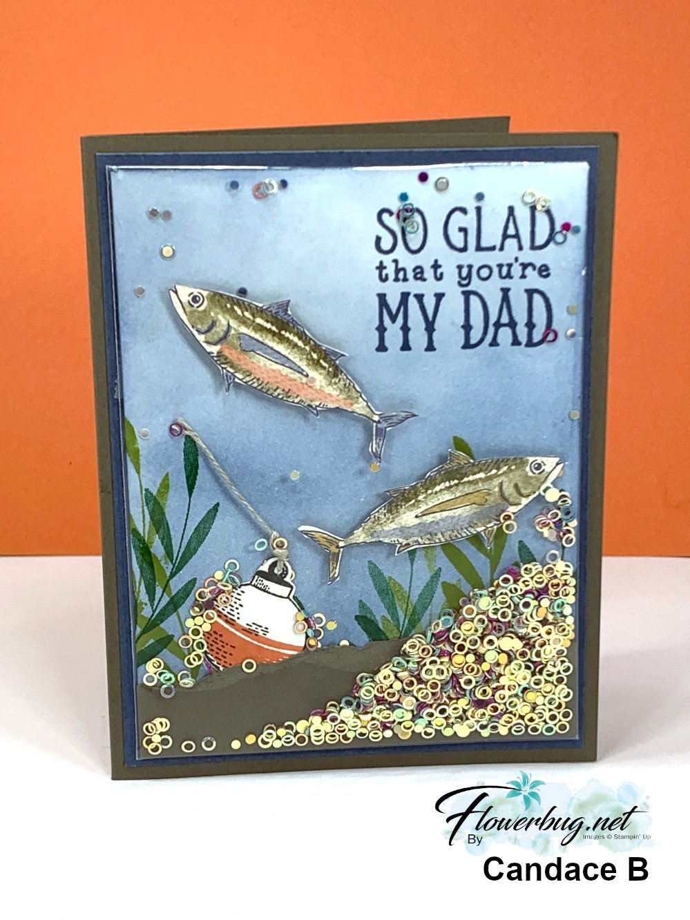

It's hard to tell but the colored and stamped panel is placed in one of our clear envelopes so she could add the new Iridescent shaker circles seen here. She added Boho Blue ink to the neutral card front using a Blending Brush, then stamped the greeting and leaves. She also fussy cut the fish from the Let's Go Fishing designer series paper and added them with Dimensionals. Then came the torn card stock layer and the bobbin and linen thread. 

Now she placed the entire piece inside a clear envelope, folded over the excess and secured it with adhesive. Now she added the shaker circles from the top open edge before closing it off to seal.  Add it to your card base layers and you're done! 

You can see these clear envelopes here.  I use them for card swaps, storing & protecting my finished cards and of course for easy shaker cards. They're $7 for 50 envelopes! 

This is such a fun card to make AND receive! It's hard to stop shaking it! 

~~~

July Specials: 

Bonus Days!

Get a $5 coupon for each $50 order you place in July.  Use the coupon in August!
2. PAPER PUMPKIN 48-HOUR SALE!

3. Next is a Clearance Rack update!

See all items available here

4. NEW Online Exclusives will be available

See them all here

~~~

Plus my monthly special for online orders:

Get a free card kit & a new Beautifully Happy stamp set 

with online orders over $65; must use a host code.

*current host codes: BKEARDMW or GGDRKFQR

All Posts

  • Thoughtful Journey designer paper paired with In The Grove for stunning results!


    I shared this beautiful card on last week's Live video. 

    It features a few new products in the 1024-25 Annual Catalog;

    This Thoughtful Journey designer paper is incredible! Many people love the watercolor look of this type of scenic paper.

    To me it seems the perfect choice for thinking of you, sympathy or get well cards.  

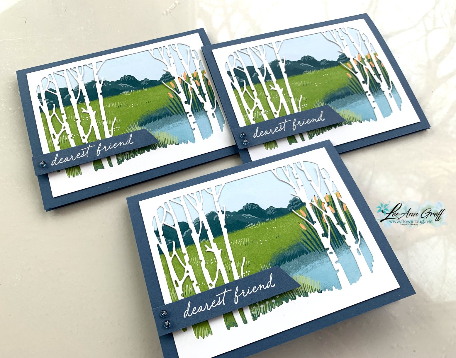
    I made a few of these cards with the Lily Pond Lane designer paper too.  You can see both in the photo below:

    Here's a free printable project sheet for you: Download In the Grove scene

    My card bases are Misty Moonlight and the White birch tree die-cut is approximately 5" X 3 3/4"; as is the designer paper under it.  See the Lily Pond Lane designer paper here. 

    I think these scenic cards are fabulous.  Those birch tree die-cuts sure make quick but beautiful cards! 

    You can see this card being made on my video below plus another card made with the In the Grove bundle. 

    ~~~

    May Specials: 

    *current host code link:  D6QRFZ7J or FCJ937QT

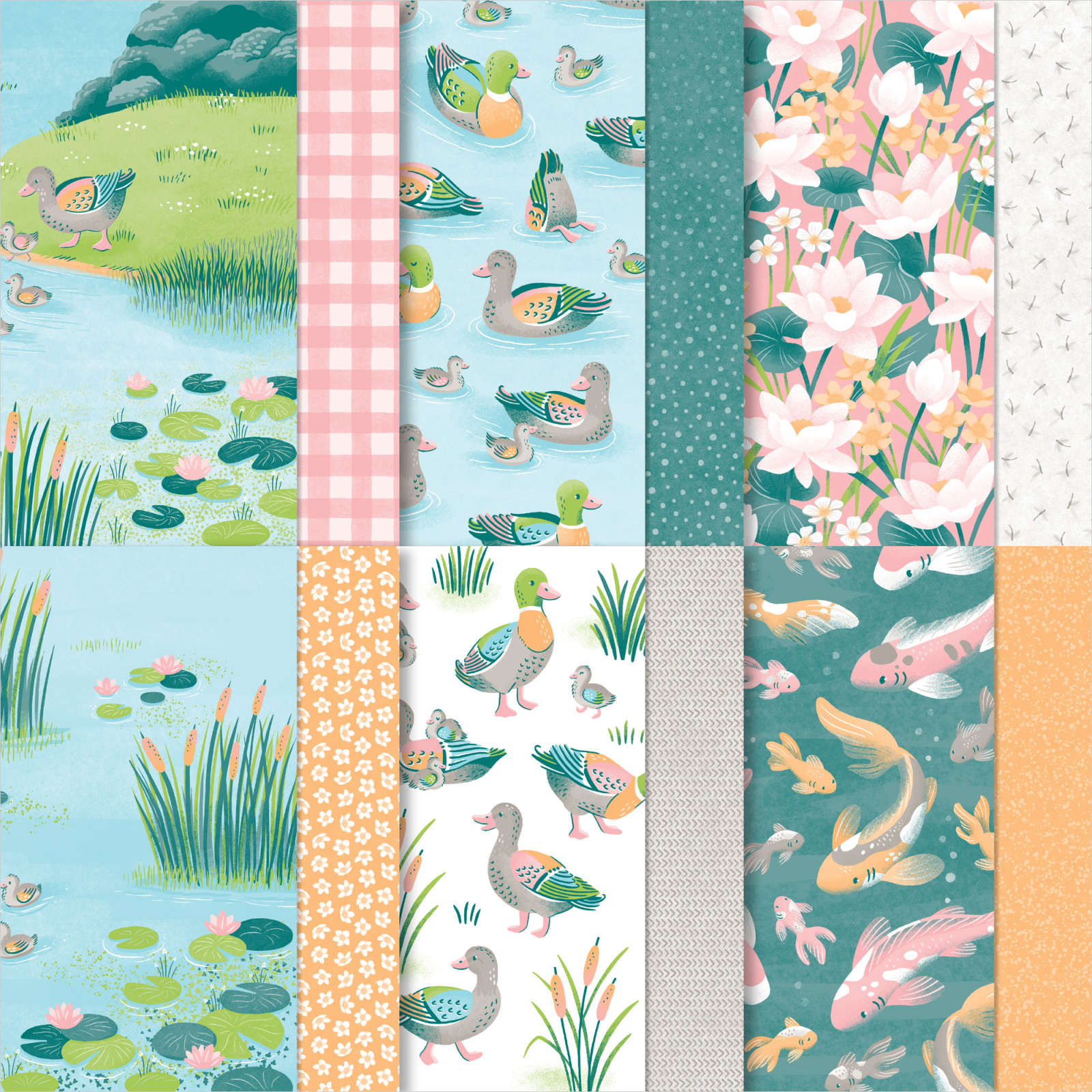
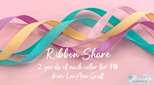
    Click on the pictures above or below to get to my new catalog shares – choose from designer papers or a ribbon share. 

    ~~~

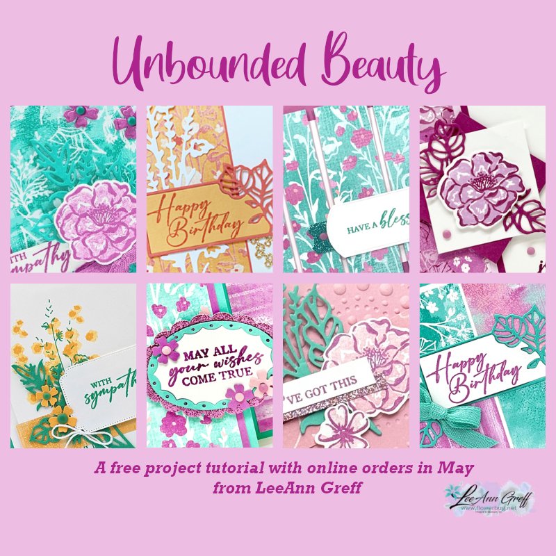
    All online orders in May will receive a free project tutorial and if your order is over $50 I'll also send you a pre-cut card kit!

    Leave a Reply

    Your email address will not be published. Required fields are marked *

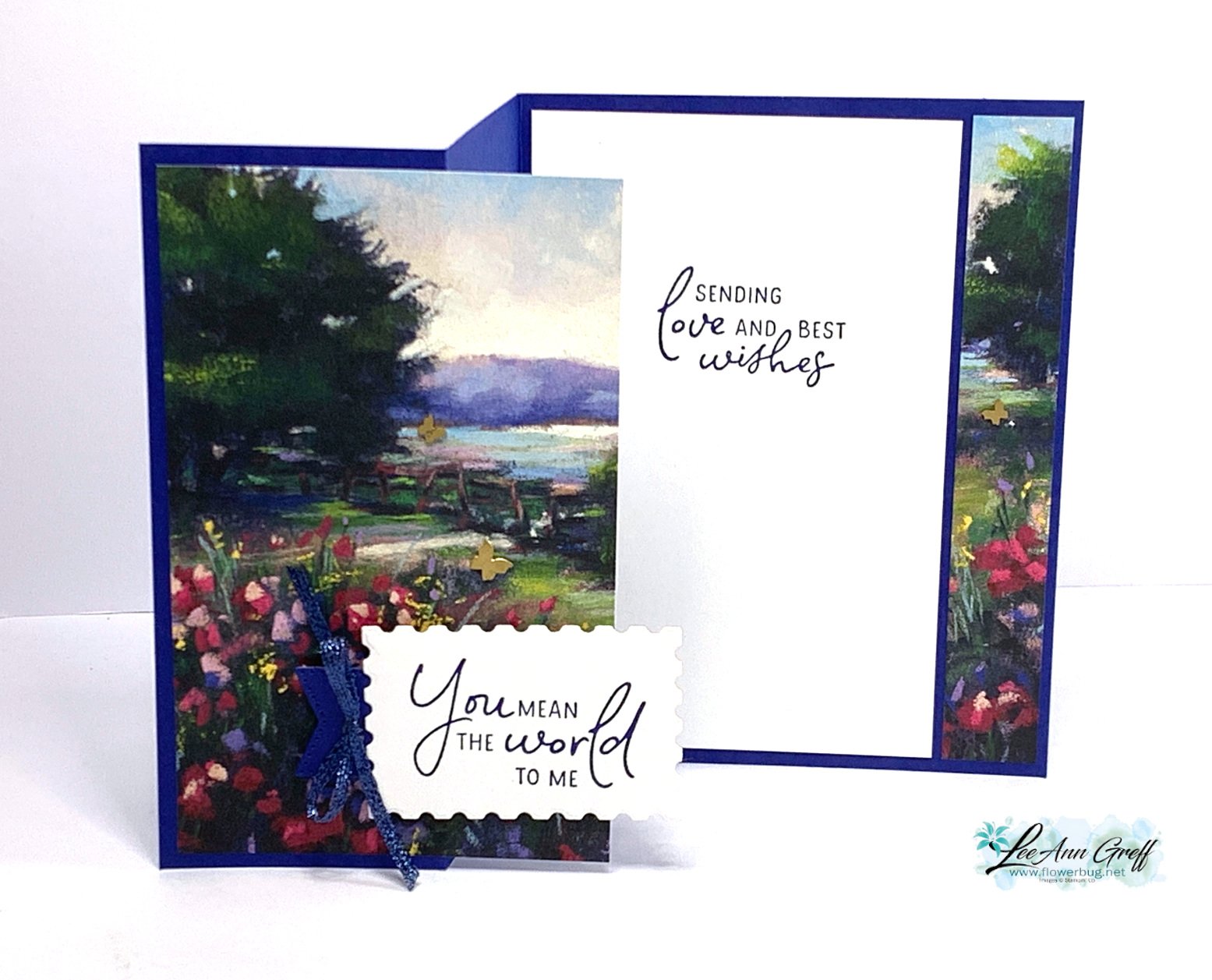
  • A WOW fun fold card that has to be the easiest ever!


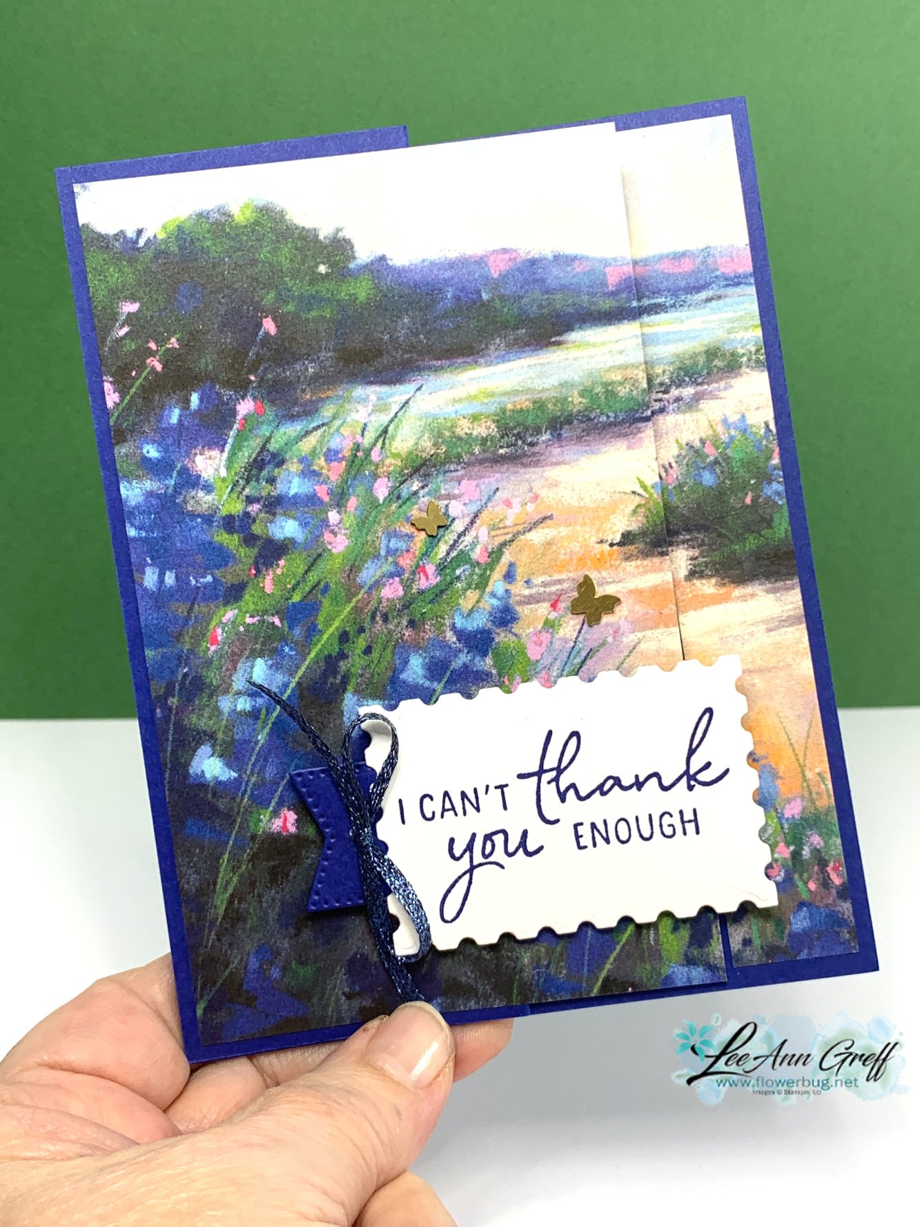
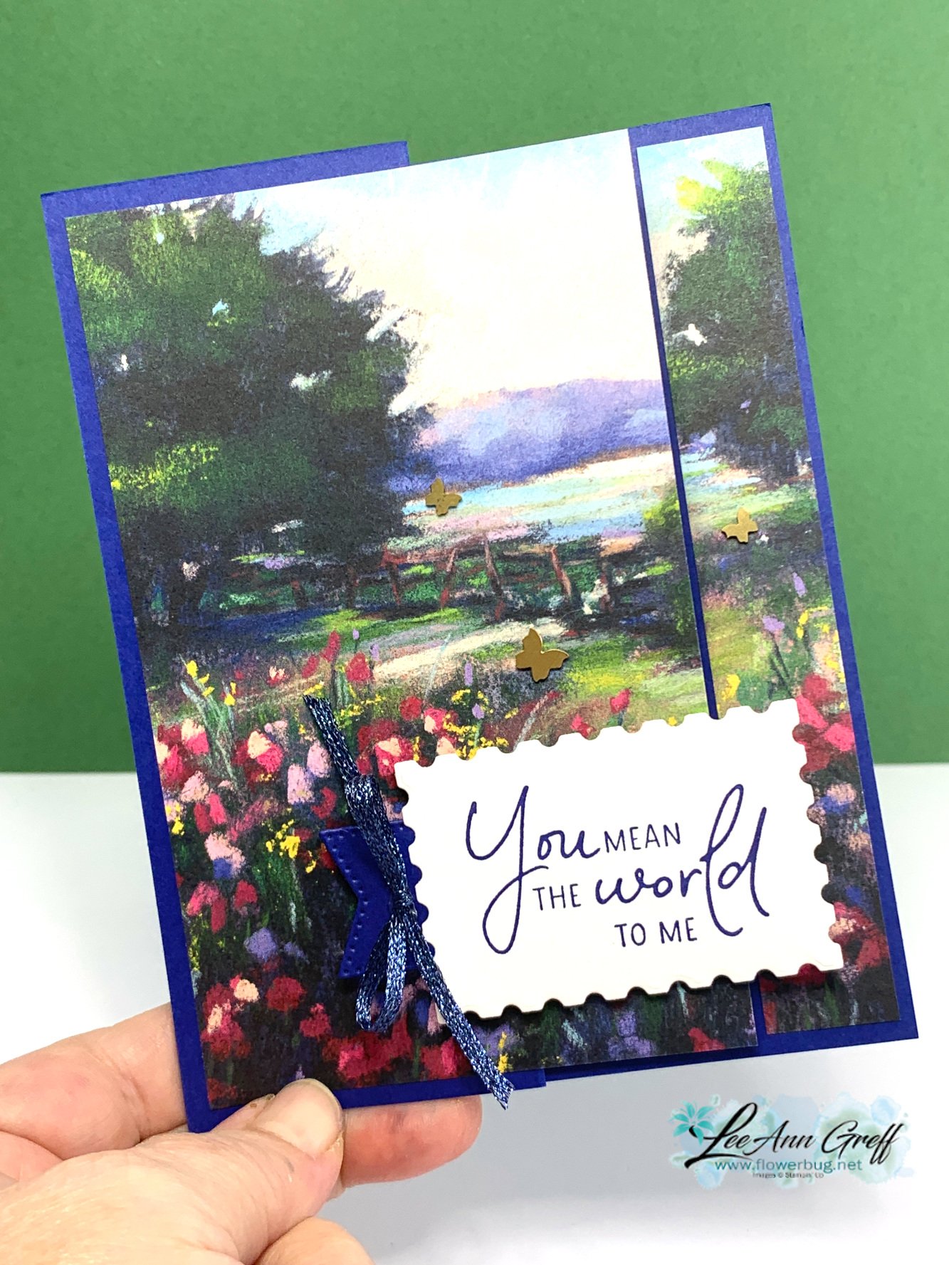
    If you are looking for a great idea for designer papers that create a scene this layout is it!  

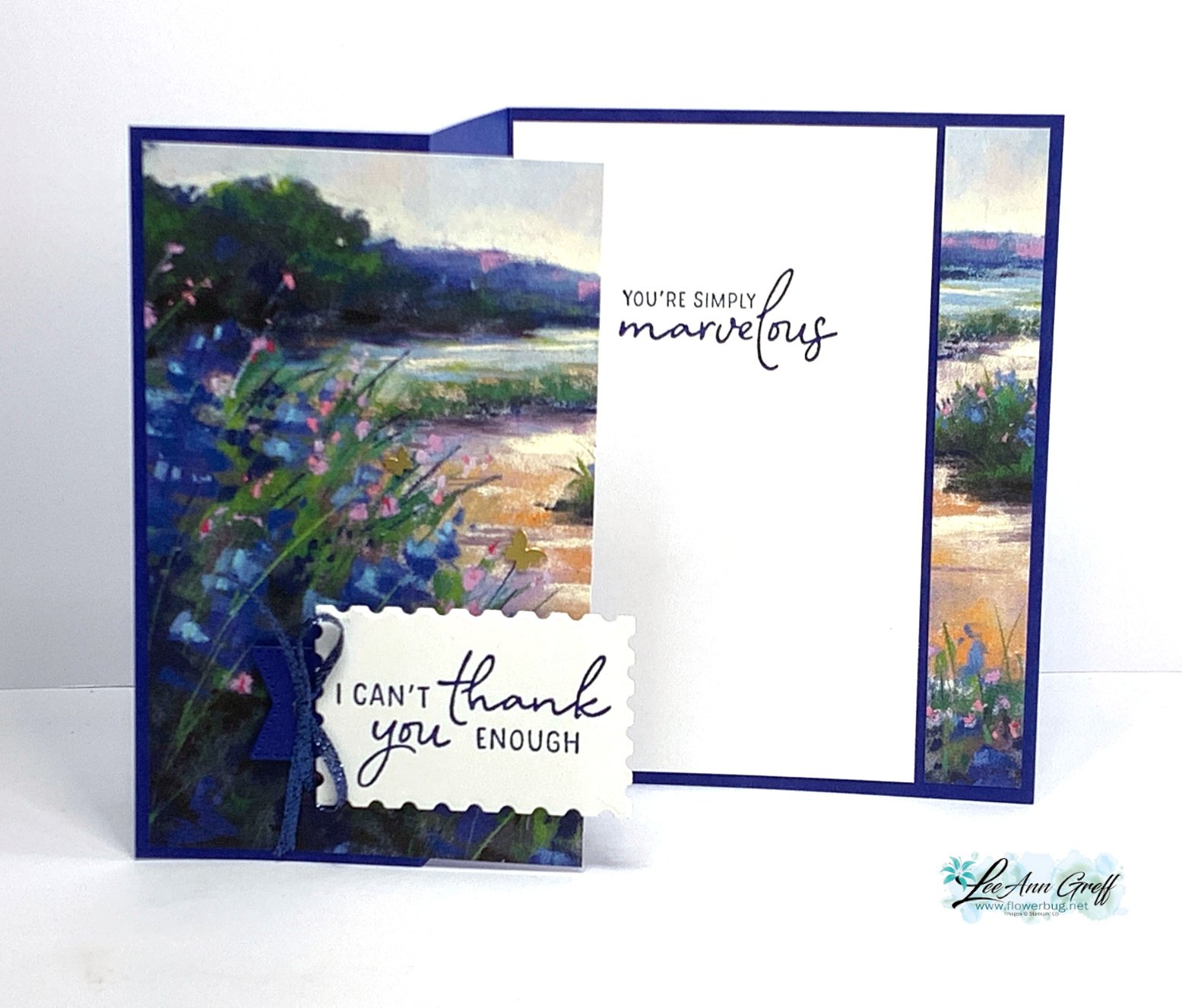
    Start with a card base of 8 1/2" X 5 1/2" scored at 2 1/8" and 4 1/4".  Then cut a 4" X 5 1/4" piece of designer paper and trim off the right side at 3/4". Add that strip to the left side of your card base and the larger half to the left folded side. 

    Isn't that the best & most simple layout?!  Think of the many cards you could make with this design. 

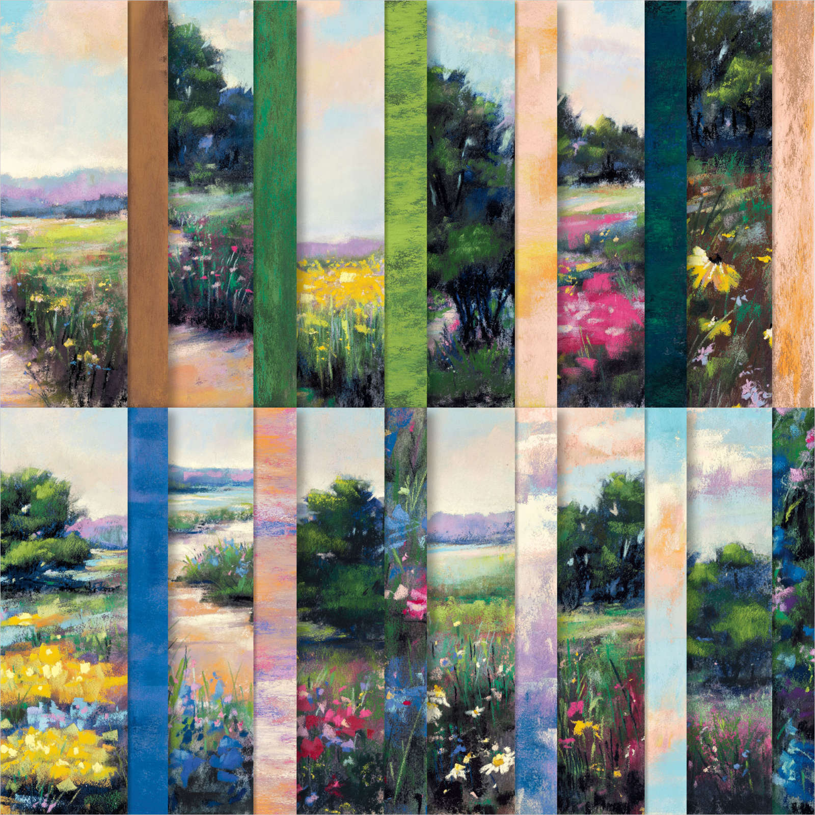
    The card features the stunning Meandering Meadows designer paper pack.  This paper can be found here in our Online Exclusives – but is currently unavailable until later May.

    I wouldn't wait too long to order this DSP; when they run out they don't always re-order and then it's gone for good.  That's how the Online Exclusive products work.  

    Here's an inside view: 

    If you'd like to have a project sheet with measurements, photos and products used, here you go. Here is the free project sheet for this super simple but gorgeous card. Download April Club Perennial Postage scene

    There are so many beautiful scenes in this pack of paper and most sheets coordinate with our Starry Sky, Balmy Blue or Shaded Spruce cardstock. *Starry Sky has retired now; I will miss this pretty blue color.

    I featured the Perennial Postage bundle for both the greetings and the label die-cut.

     The dies did carry over into the new catalog but the stamp set did not and is retired now.  The dies are currently out of stock but should be available in about 2 weeks; around May 13th. 


    I hope you like this simple but beautiful card.  It's perfect when you need a quick but fabulous card design. 

    **Below is the video for this card and my In Color cards: 

    ~~~

    May Specials: 

    *current host code link:  D6QRFZ7J or FCJ937QT

    Click on the pictures above or below to get to my new catalog shares – choose from designer papers, In Color bundles or a ribbon share. They're available through May 7th only. 

    All online orders in May will receive a free multi-project tutorial and a share of !

    Leave a Reply

    Your email address will not be published. Required fields are marked *

  • Understanding Color Theory (the Color Wheel) with video


    If choosing color combinations is challenging for you the Color Theory video below may help you out. 

    You can find a printed color wheel in the new Annual Catalog on page 132.  Some of us lucky Demo's received a real color wheel at OnStage in Houston.  It was a surprise perk for attendees. 

    Stampin' Up! has heard from many people begging for one since they saw it. Stay tuned; they are producing another that will be available for purchase later this year.  In the meantime please watch the video seen further below to see how you can use this color wheel.

    Here's a photo of the printed color wheel in the catalog: 

    My top favorite and easiest way to combine colors is Monochromatic. This means hues of one color – blues, greens etc.  Monochromatic projects are soothing to the eye and can be seamless.  

    My second favorite is to use complimentary colors such as pink & green or yellow with purple. 

    If you're using designer paper Stampin' Up! has done the work for you – just choose from the colors listed on the back of each package. 

    Honestly, how I usually choose colors is to hold the card stock pieces next to each other. For me that's easy, but I know others struggle so I hope the video below will help you out.  

    ~~~

    May Specials: 

    *current host code link:  D6QRFZ7J or FCJ937QT

    Click on the pictures above or below to get to my new catalog shares – choose from designer papers, In Color bundles or a ribbon share. They're available through May 7th only. 

    All online orders in May will receive a free multi-project tutorial and a share of !

    Leave a Reply

    Your email address will not be published. Required fields are marked *


Notice: LeeAnn Greff, Independent Stampin’ Up! Demonstrator, Manager. The content of this website is my sole responsibility as an independent Stampin’ Up! demonstrator and the use of, and content of, the classes, services, or products offered on this website is not endorsed by Stampin’ Up! Copyright 2025