/


Latest Post

Baby Swipe technique with tips & video! Plus retiring lists & colors.


They released the retiring lists from the Annual & Spring catalogs yesterday.  Here are the lists:

Here's the Annual Catalog retiring list: Download 2022-2023 Annual Catalog Last Chance Products_US Landscape

And here is the Spring (January-April) retired list Download January-April 2023 Mini Catalog Last Chance Products_US Landscape

*There is a sale on some of these retiring items but the discounts do not start until April 4th. 

Here's a graphic on which colors are retiring. Go here to shop and get the items you need before they're gone! 
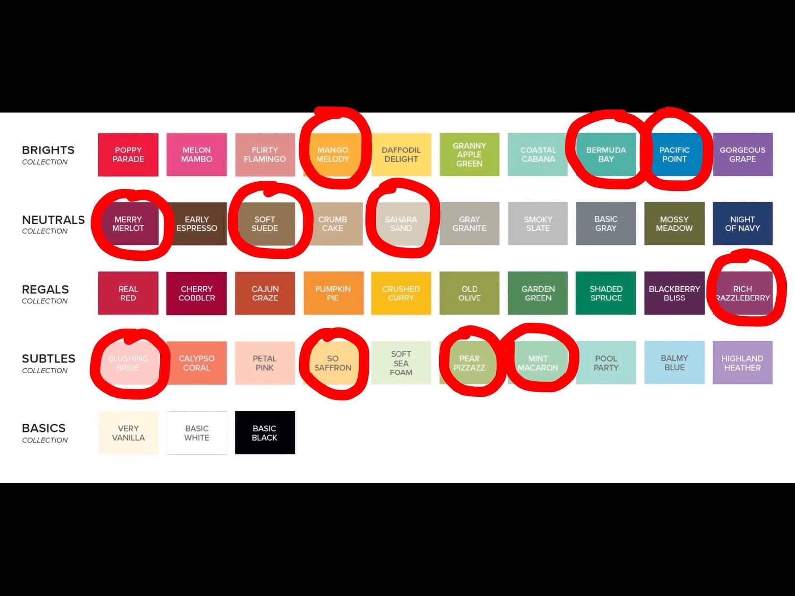
Sad to say good bye to these colors: 
  • Soft Suede 
  • So Saffron
  • Blushing Bride
  • Mint Macaron
  • Pear Pizzazz
  • Pacific Point
  • Mango Melody
  • Rich Razzleberry
  • Bermuda Bay
  • Merry Merlot
  • Sahara Sand

Which are returning?
  • Fresh Freesia!!
  • Misty Moonlight
  • Blueberry Bushel
  • Berry Burst
  • Lemon Lime Twist
  • Lost Lagoon
  • Pretty Peacock

~~~

Have you ever done the baby swipe technique?  It's so fun; playing with baby wipes and ink refills is a bit addictive!  

I made this card for our March Team swap; the theme was to use a technique involving ink refills.  
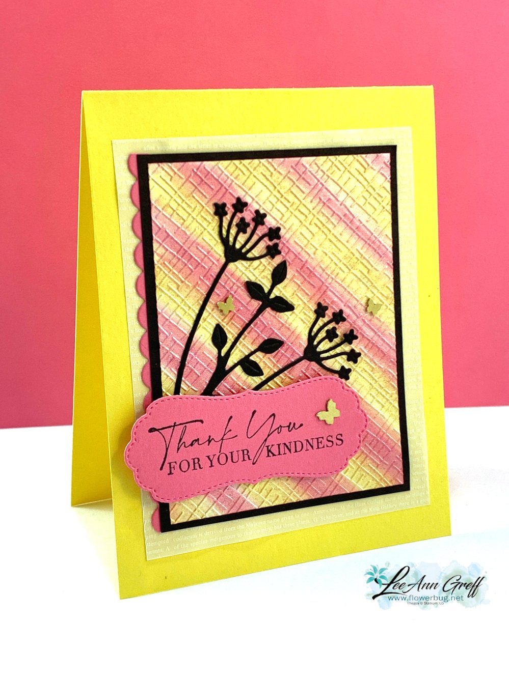
My colors include Daffodil Delight, Polished Pink and Black.  

Other products used:

Can you spot the shimmer?  I used the Pearlescent paper from the Annual Catalog.  See it here. 

It was the perfect sheen for this technique as the moist ink did not absorb quickly like it might for regular card stock. Glossy paper would also work well. 

After I added the color, I let it dry for an hour or so.  Then I textured it with one of the embossing folders in the 3D Basics pack seen here.  These are currently out of stock but they'll be back in May. 

Below you can see the difference in my cards; especially the colors. One is soft and subtle and the other more vibrant.  This happens as you work with your baby wipe; the first few swipes are bold and the next few are much softer. 

Tips for success: 

  • Fold and roll your baby wipe in a tube.  Hold it tightly and add a few drops of ink refills. 
  • Add each color separately in a row.  I tend to add enough for about 1/2" of surface. 
  • Start swiping off your paper and then onto it.  You can do straight swipes or get creative and add curves or swirls. Let dry.
  • Shimmery, pearlescent or glossy works best. But you can do it on regular card stock too. 
  • I suggest you use light to medium colors. 

Notice the colors of the butterflies? I colored the Brass Butterflies with a Polished Pink blends marker for the left card.  I wasn't sure I liked it or not so left them uncolored for my swap cards.  

Watch the video here or click on the image below to see this technique. It's the last technique I share in the video. 

~~~

March Specials:

See the new Online Exclusives here! 

*current host code: QBQB4TBF or BFE4C2KM

See the Jan-Apr 2023 Last Chance list here *sale prices start April 4th 

See the 2022-2023 Annual Catalog Last Chance list here

Get a free class kit with online orders over $55 when using the host code above!

I have three left! *after that you'll receive a pack of 10 handmade cards! 

Earn free products with my loyalty rewards! 

Click here to download yours and earn a $50 shopping spree!

All Posts

  • The Color Coach is back!


    If you struggle with coordinating colors the Color Coach can help.  It provides multiple ways to find the perfect combinations. 

    The Color Coach is Stampin' Up!'s version of the color wheel and is based on color theory—the combination of art and science that determines what colors look good together.

    One side of the Color Coach has all current Stampin’ Up! colors (except Neutrals) laid out with a spinning wheel in the center. This center wheel gives you monochromatic, complementary, analogous, and triadic information about our colors. The back explains each of these concepts, plus our range of neutral colors.

    It's $12.50 and can be seen here. 

    For example who would think Pretty Peacock and Pumpkin Pie would go together so well?  They're on the edge of complimentary colors but work wonderfully! 

    Below is a sample of an Analogous color combination.  SU created designer papers with shades of similar colors using our Full of Life DSP in the Annual Catalog. 

    Have a great weekend! 

    ~~~

    December Specials:

    *current host code link:  

    P243X6VH

    3 new designer papers!

    ~~~

    Available December 3rd; while supplies last!

    ~~~

    ~~~

    Leave a Reply

    Your email address will not be published. Required fields are marked *

  • Adorable Card swaps featuring the Otterly Amazing suite


    Today I'm sharing swaps that feature the adorable Otterly Amazing suite from our recent release of Online Exclusives.  

    First is a card made by Kelly Acheson.

    The placement of her DSP is unique and leaves room for the cute swimming fish at the bottom.  She used the coordinating stamp & dies for her otter, coloring it with Blends markers.  Her colors include Crumb Cake and Early Espresso. 

    Next is a fun fold card by Tracy Jacobs.

    She made a cut on her card base and adhered the right side down which allowed the left side to open.  Her colors include Gray Granite with White.

    Measurements – card base 4 1/4" X 11" score at 5 1/2". At the bottom right cut to the score line at the 1" mark.  the DSP and inside White layer are 3" X 5 1/4".  The punch is the Modern Oval punch from the Annual Catalog. 

    Lastly we have a sweet card made by Julie Davison. 

    Her colors include Old Olive, Early Espresso, Balmy Blue & Calypso Coral. She cut the otter from the Otterly Amazing DSP seen here.  Her circle punches and angled DSP add a bit of playfulness that matches up with the jumping otter. 

    See this suite here online. 

    ~~~

    December Specials:

    *current host code link:  

    P243X6VH

    3 new designer papers!

    ~~~

    Available December 3rd; while supplies last!

    ~~~

    ~~~

    Leave a Reply

    Your email address will not be published. Required fields are marked *

  • Cute swaps with the Perfect Pairs


    Today I'm sharing a few card swaps made by gals in a long distance swap. 

    First is a card made by Selene Kempton. She is someone I've recently become friends with and I cannot say enough about her huge heart and fun personality. 

    I love her color choices of Petal Pink with Crumb Cake, White & Early Espresso.  Cute layout too!  Her cards are often among my favorites.  The textured background is made with the Dashing Designs embossing folder seen here. 

    ~~~

    This next cute card was made by Kay Cogbill. 

    She used the Marbled Elegance specialty DSP for the background and as a layer under her main image. 

    You can find this adorable Perfect Pairs stamp set here.  It's in our online exclusives but that just means it's not seen in any printed catalog. Anyone can order these items! 

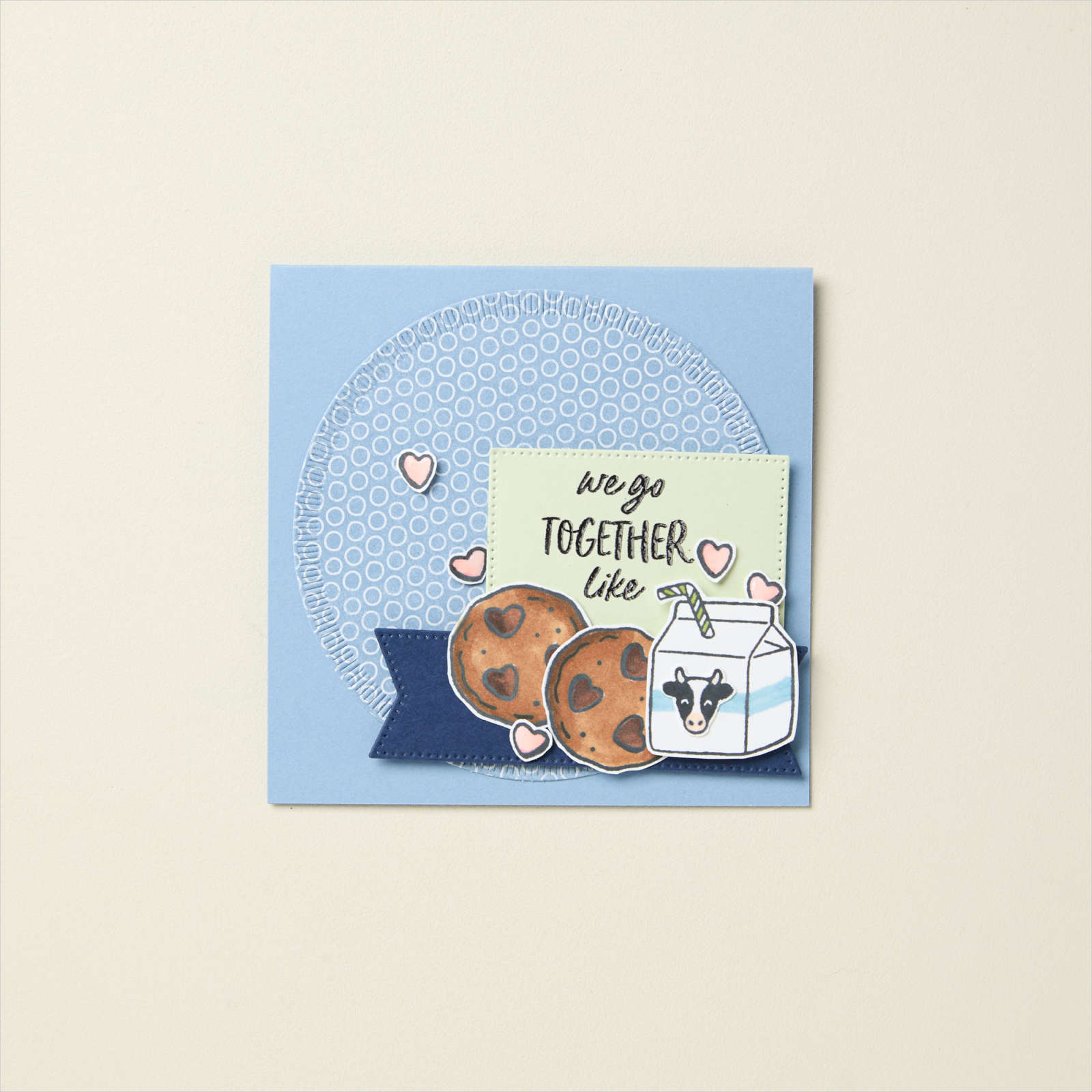
    Here's another sample seen online in the SU store. Did you know that when you're looking at our product you can find multiple ideas from their samples? 

    I'll share more card swaps tomorrow. 

    ~~~

    December Specials:

    *current host code link:  

     FFMDFU3J

    3 new designer papers!

    ~~~

    Available December 3rd; while supplies last!

    ~~~

    ~~~

    Leave a Reply

    Your email address will not be published. Required fields are marked *


Notice: LeeAnn Greff, Independent Stampin’ Up! Demonstrator, Manager. The content of this website is my sole responsibility as an independent Stampin’ Up! demonstrator and the use of, and content of, the classes, services, or products offered on this website is not endorsed by Stampin’ Up! Copyright 2025