/


Latest Post

A few favorite craft storage tips


I thought I'd share some of my favorite ways to store my stamping products.  Some people enjoy organizing more than creating! 

First is how I store my stamp sets.  In a dresser drawer.  I purchased a few dressers from IKEA many years ago and they've held up very well despite multiple moves.  

Here's a photo of my craft studio.  I am very, very lucky to have such a beautiful room in our home for my business and classes. 


Here's how I store my 8 1/2" X 11" card stock and paper scraps.  In front of each color of card stock I keep a cello bag for the scraps in that color. I've used this method for years and it really helps me use my scraps.
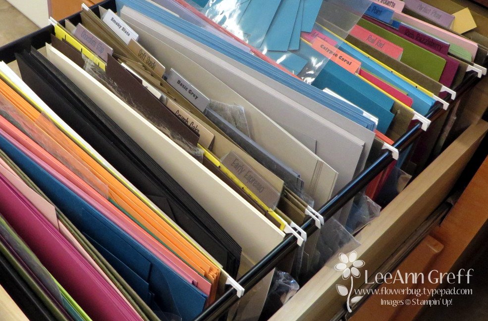
Next is how I store my 12 X 12" designer paper and scrapbook pages. 
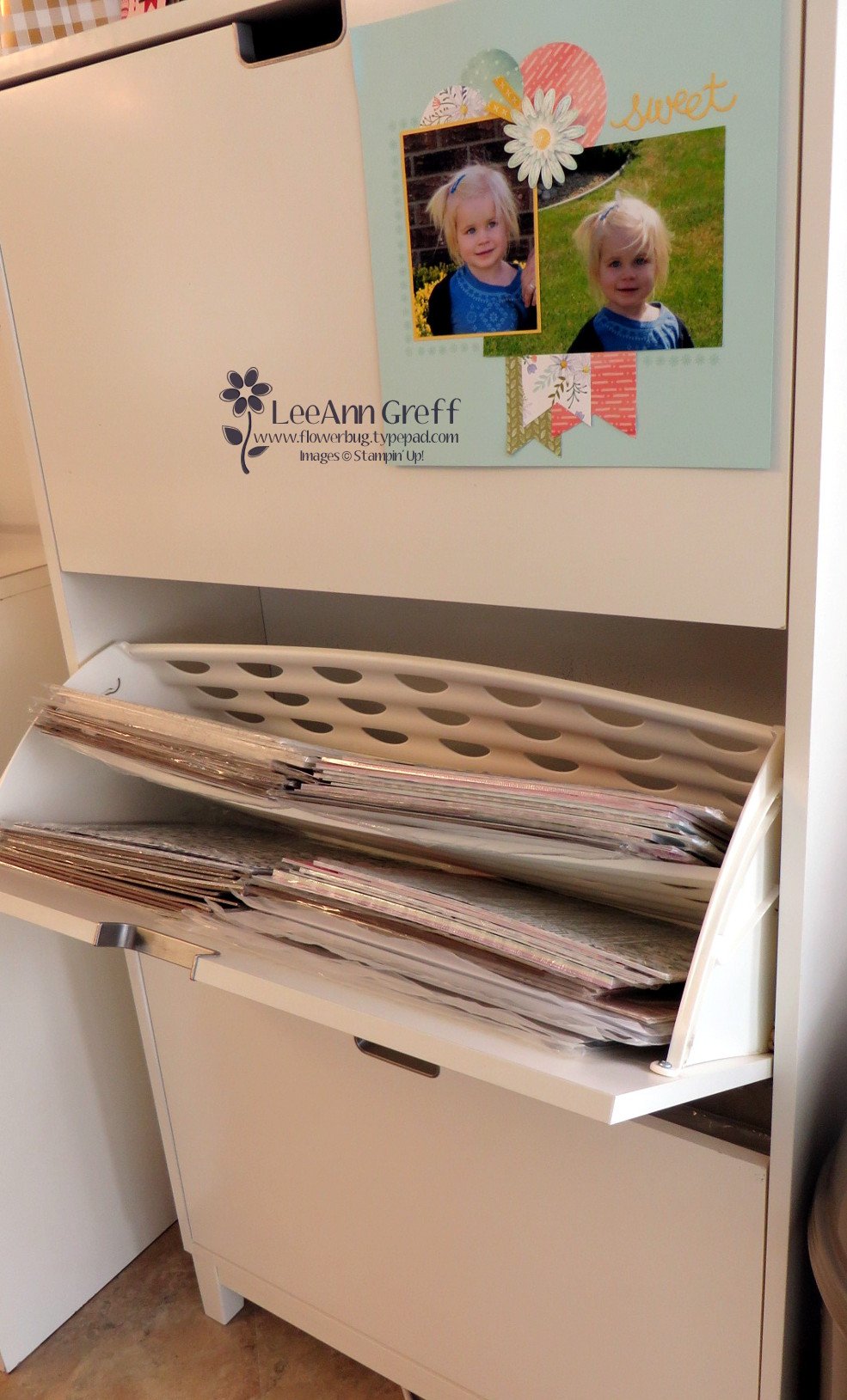
It's a shoe storage cabinet! My 12 X 12" paper fits like it was made just for it!  You can get two stacks side by side in it since it's about 30" wide.    Plus it has a divider to fit even more paper above it.  I love the way the doors hinge open.  There are three doors and it's only about a foot deep.

Lastly here's how I store my inks, markers and ribbon. These are Stampin' Up! storage and they're fully customizable to fit what you need.  Click here to see the options. 

I love that it fits right on my work area for easy reach. As you can see I organize my inks in rainbow order. I'm not sure why my Blends aren't but I know my granddaughter will love to do that for me this week while she's here.  

~~~

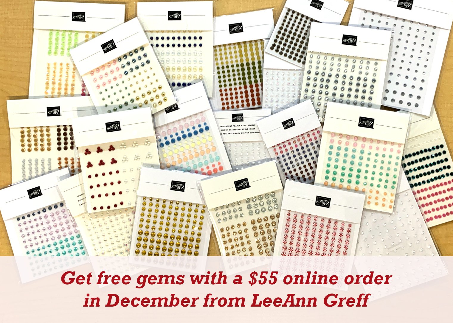
December Specials:

*current host code link:  

P243X6VH

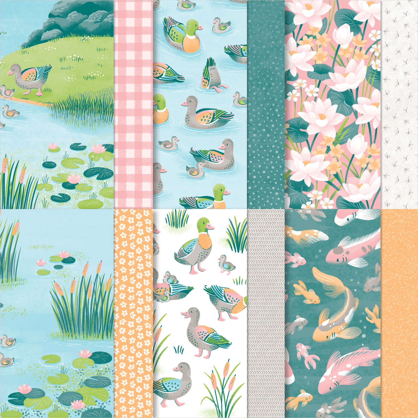
3 new designer papers!

~~~

Available December 3rd; while supplies last!
~~~
~~~

All Posts

  • Thoughtful Journey designer paper paired with In The Grove for stunning results!


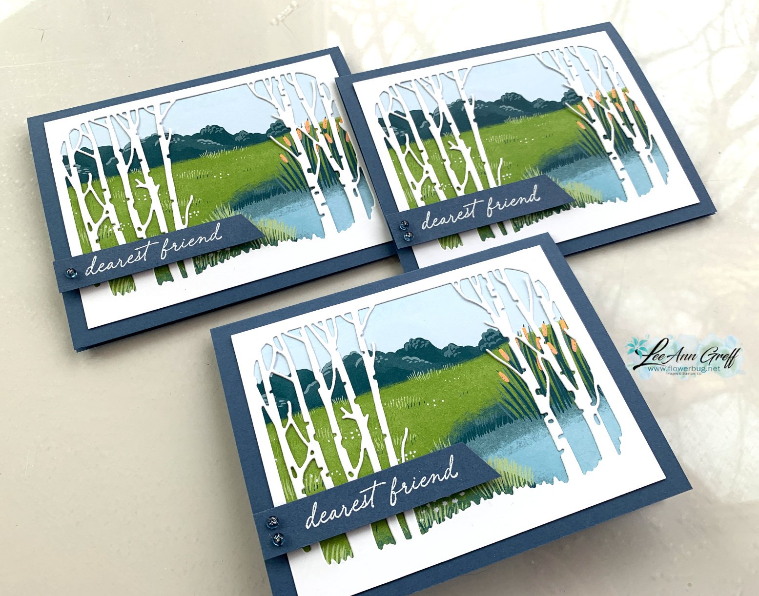
    I shared this beautiful card on last week's Live video. 

    It features a few new products in the 1024-25 Annual Catalog;

    This Thoughtful Journey designer paper is incredible! Many people love the watercolor look of this type of scenic paper.

    To me it seems the perfect choice for thinking of you, sympathy or get well cards.  

    I made a few of these cards with the Lily Pond Lane designer paper too.  You can see both in the photo below:

    Here's a free printable project sheet for you: Download In the Grove scene

    My card bases are Misty Moonlight and the White birch tree die-cut is approximately 5" X 3 3/4"; as is the designer paper under it.  See the Lily Pond Lane designer paper here. 

    I think these scenic cards are fabulous.  Those birch tree die-cuts sure make quick but beautiful cards! 

    You can see this card being made on my video below plus another card made with the In the Grove bundle. 

    ~~~

    May Specials: 

    *current host code link:  D6QRFZ7J or FCJ937QT

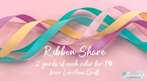
    Click on the pictures above or below to get to my new catalog shares – choose from designer papers or a ribbon share. 

    ~~~

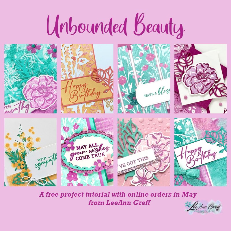
    All online orders in May will receive a free project tutorial and if your order is over $50 I'll also send you a pre-cut card kit!

    Leave a Reply

    Your email address will not be published. Required fields are marked *

  • A WOW fun fold card that has to be the easiest ever!


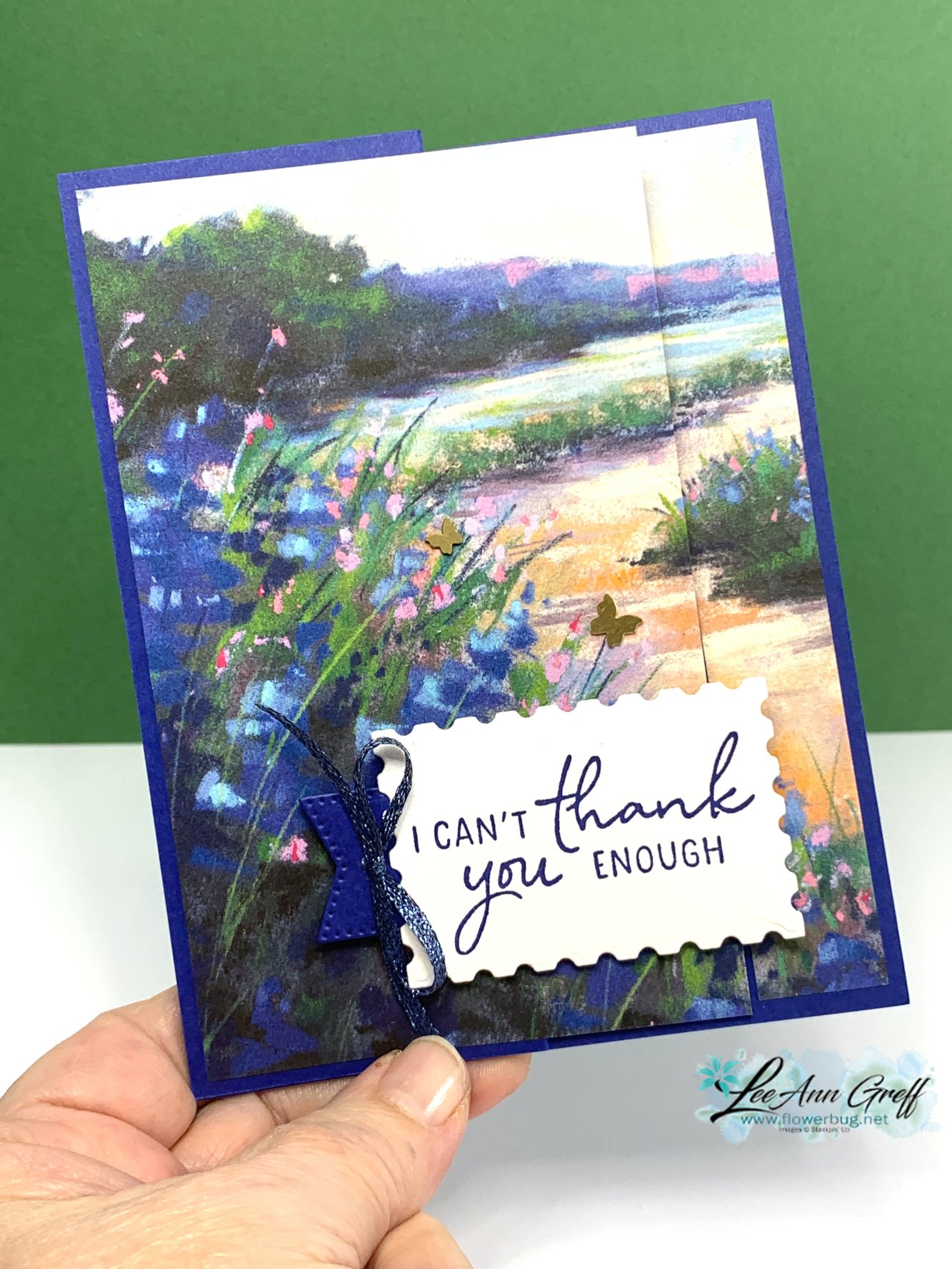
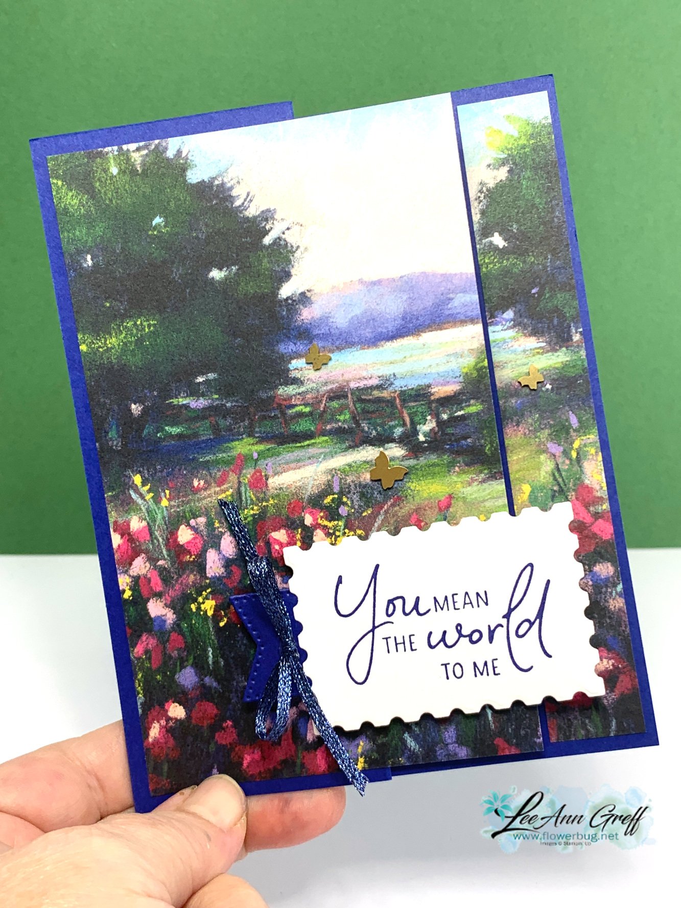
    If you are looking for a great idea for designer papers that create a scene this layout is it!  

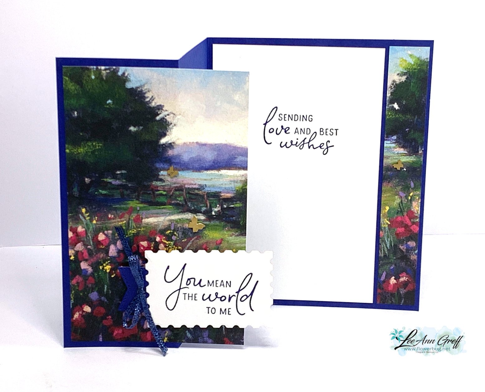
    Start with a card base of 8 1/2" X 5 1/2" scored at 2 1/8" and 4 1/4".  Then cut a 4" X 5 1/4" piece of designer paper and trim off the right side at 3/4". Add that strip to the left side of your card base and the larger half to the left folded side. 

    Isn't that the best & most simple layout?!  Think of the many cards you could make with this design. 

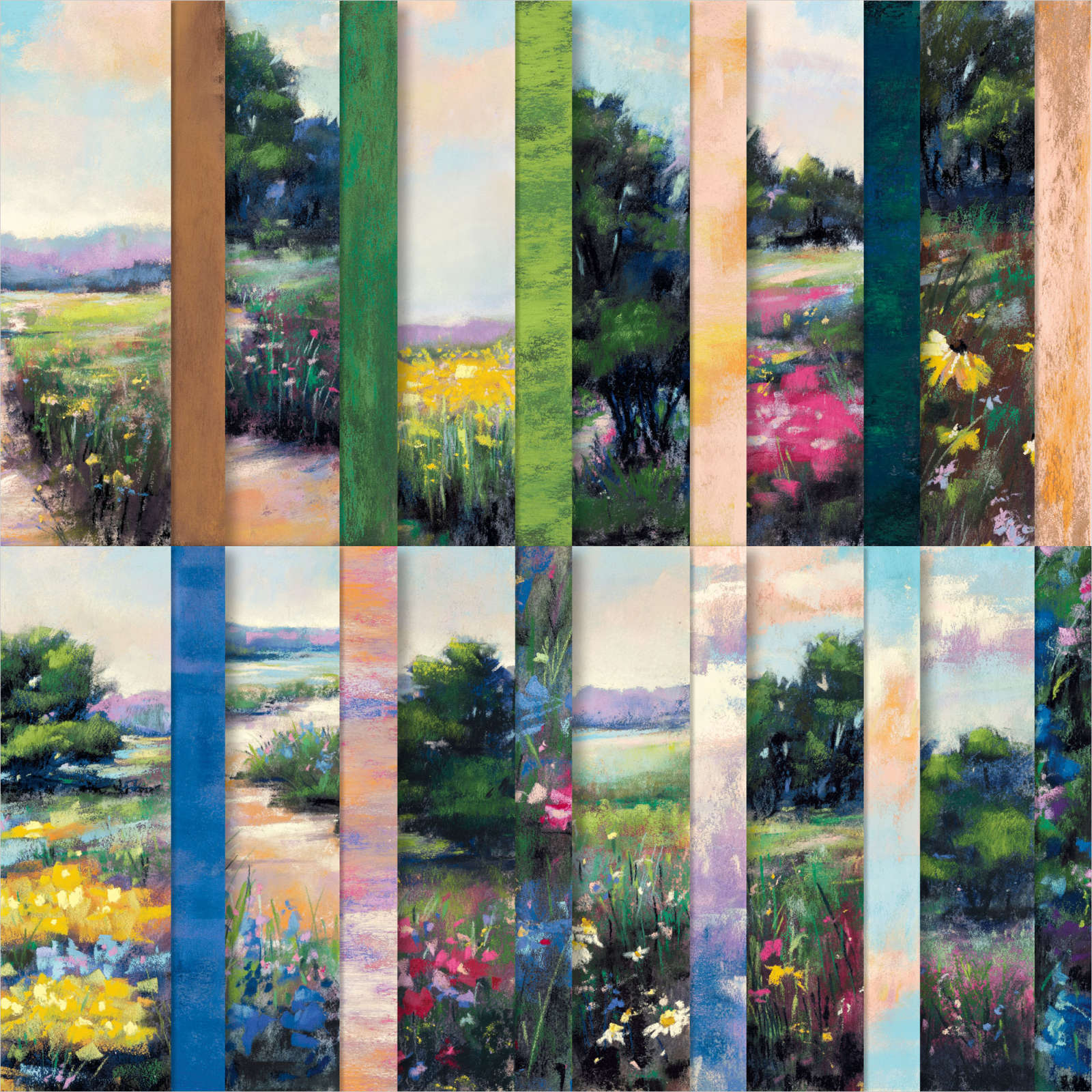
    The card features the stunning Meandering Meadows designer paper pack.  This paper can be found here in our Online Exclusives – but is currently unavailable until later May.

    I wouldn't wait too long to order this DSP; when they run out they don't always re-order and then it's gone for good.  That's how the Online Exclusive products work.  

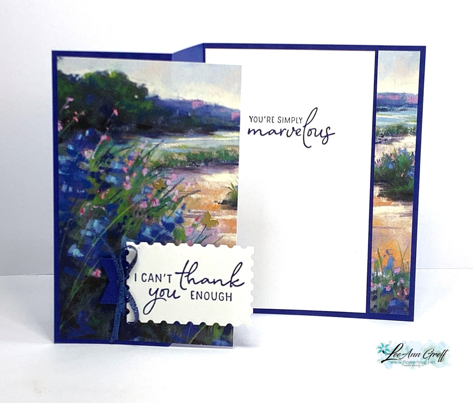
    Here's an inside view: 

    If you'd like to have a project sheet with measurements, photos and products used, here you go. Here is the free project sheet for this super simple but gorgeous card. Download April Club Perennial Postage scene

    There are so many beautiful scenes in this pack of paper and most sheets coordinate with our Starry Sky, Balmy Blue or Shaded Spruce cardstock. *Starry Sky has retired now; I will miss this pretty blue color.

    I featured the Perennial Postage bundle for both the greetings and the label die-cut.

     The dies did carry over into the new catalog but the stamp set did not and is retired now.  The dies are currently out of stock but should be available in about 2 weeks; around May 13th. 


    I hope you like this simple but beautiful card.  It's perfect when you need a quick but fabulous card design. 

    **Below is the video for this card and my In Color cards: 

    ~~~

    May Specials: 

    *current host code link:  D6QRFZ7J or FCJ937QT

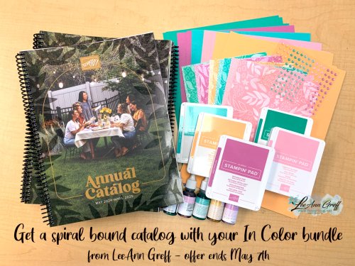
    Click on the pictures above or below to get to my new catalog shares – choose from designer papers, In Color bundles or a ribbon share. They're available through May 7th only. 

    All online orders in May will receive a free multi-project tutorial and a share of !

    Leave a Reply

    Your email address will not be published. Required fields are marked *

  • Understanding Color Theory (the Color Wheel) with video


    If choosing color combinations is challenging for you the Color Theory video below may help you out. 

    You can find a printed color wheel in the new Annual Catalog on page 132.  Some of us lucky Demo's received a real color wheel at OnStage in Houston.  It was a surprise perk for attendees. 

    Stampin' Up! has heard from many people begging for one since they saw it. Stay tuned; they are producing another that will be available for purchase later this year.  In the meantime please watch the video seen further below to see how you can use this color wheel.

    Here's a photo of the printed color wheel in the catalog: 

    My top favorite and easiest way to combine colors is Monochromatic. This means hues of one color – blues, greens etc.  Monochromatic projects are soothing to the eye and can be seamless.  

    My second favorite is to use complimentary colors such as pink & green or yellow with purple. 

    If you're using designer paper Stampin' Up! has done the work for you – just choose from the colors listed on the back of each package. 

    Honestly, how I usually choose colors is to hold the card stock pieces next to each other. For me that's easy, but I know others struggle so I hope the video below will help you out.  

    ~~~

    May Specials: 

    *current host code link:  D6QRFZ7J or FCJ937QT

    Click on the pictures above or below to get to my new catalog shares – choose from designer papers, In Color bundles or a ribbon share. They're available through May 7th only. 

    All online orders in May will receive a free multi-project tutorial and a share of !

    Leave a Reply

    Your email address will not be published. Required fields are marked *


Notice: LeeAnn Greff, Independent Stampin’ Up! Demonstrator, Manager. The content of this website is my sole responsibility as an independent Stampin’ Up! demonstrator and the use of, and content of, the classes, services, or products offered on this website is not endorsed by Stampin’ Up! Copyright 2025