/


Latest Post

Spring Corners fun fold card with free project sheet & video tutorial


I totally enjoyed making this neat fun fold card.  It shows off this neat stamp set wonderfully! 

I wanted to highlight the flower image as well as the neat greeting. I used Stampin' Write markers to color my image before I stamped. 

Tips on coloring stamps with markers:

  • always us a water-based marker (never a Blends 'permanent' marker)
  • color with the lightest color first so you don't contaminate your tip with a darker color
  • huff on the image before stamping to moisten the inks – this gives a brighter image

This neat fold starts with an 11" X 4 1/4" card base with a small fold back on the front. Then the DSP layer is added behind it.  

My colors include Fresh Freesia, Blackberry Bliss or Granny Apple Green and White. The DSP is the Toadstool Gardens and the ribbon is the Fresh Freesia seam binding ribbon – both are from our free Sale-a-Bration choice.
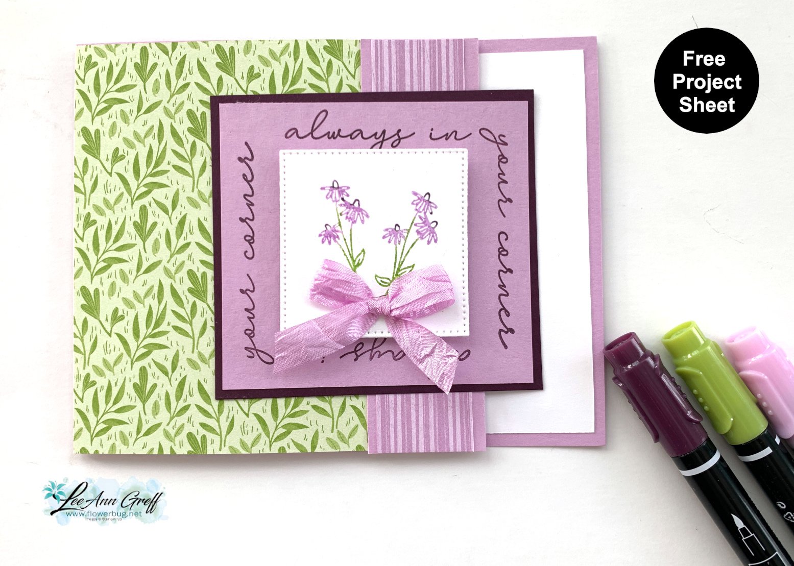
Here's the free project tutorial with measurements.  Just click on this link to print or download it. Download Spring Corners fun fold with Toadstook DSP

*Below is the video for this card and another cute card using the Spring Corners set.   

~~~

February Specials:

*current host code link:  

DNXE92GP

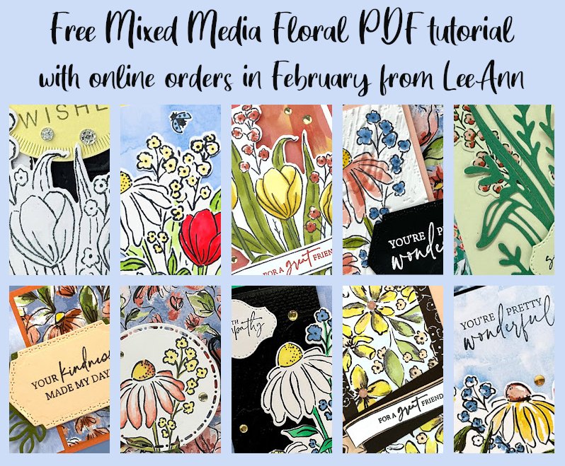
Get this free tutorial with any online order in February!
 New Sale-a-Bration items are here!

For every $60 (or $120) you spend you can choose a free item from the SAB catalog! 


 And when you choose the Starter kit in February you get a choice of 2 sets of markers & a free stamp set or an extra $30 in product.  That's $155 in value for just $99! 

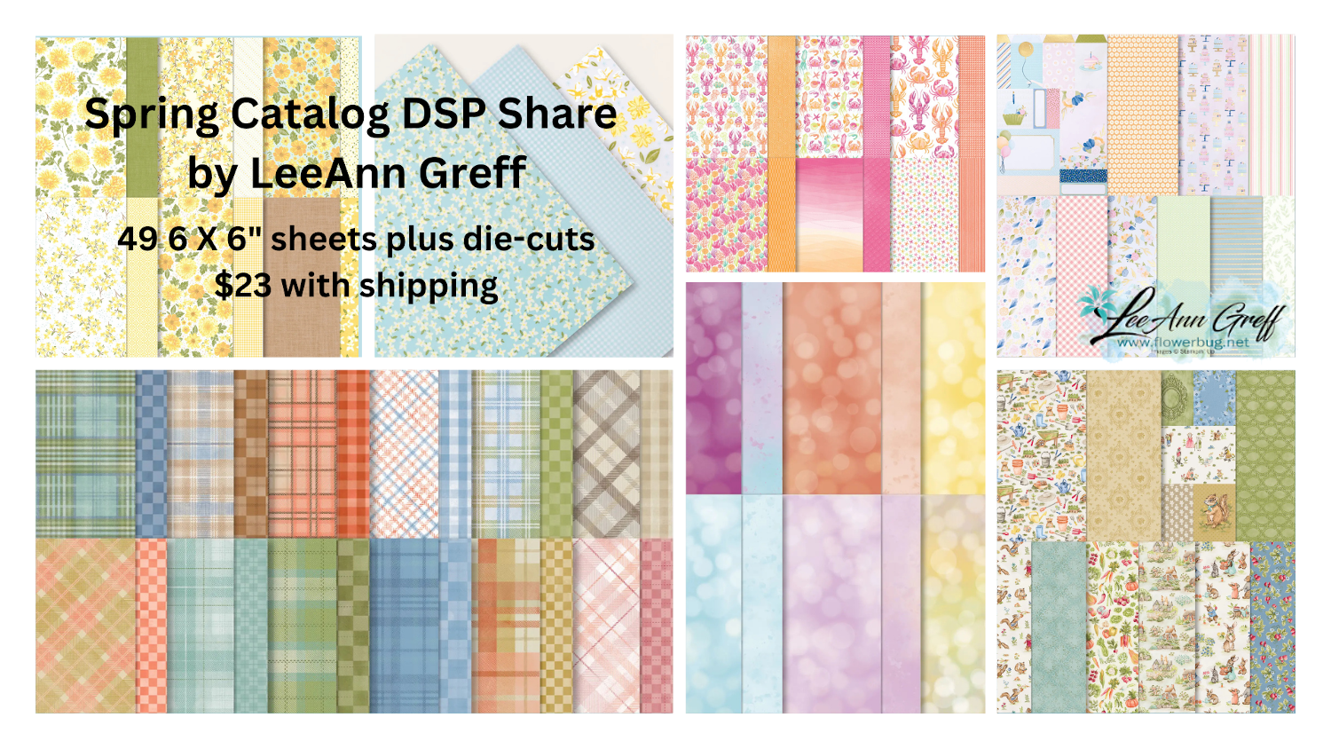
Opt in for my Spring catalog Designer Paper share and/or the Spring catalog embellishment share seen below. 

See the details here. 
Contact me here

All Posts

  • Shabby Chic Lovely & Sweet card with video tutorial & free project sheet!


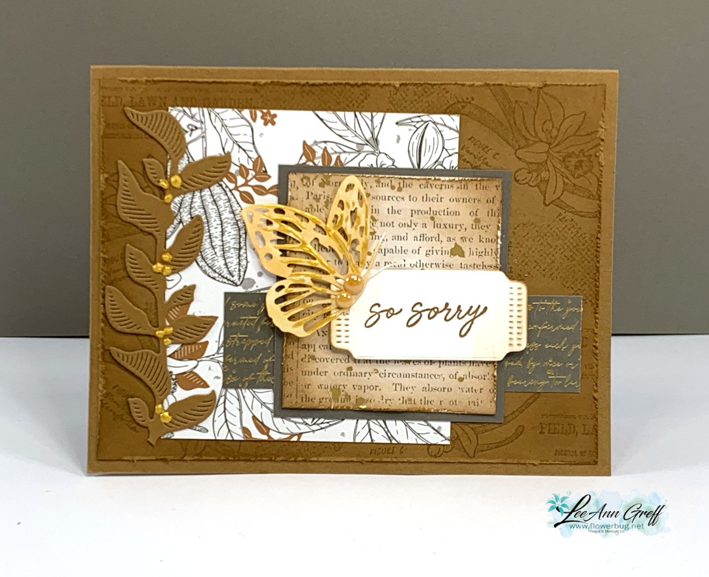
    Here's the last card made in last week's video featuring the Nature's Sweetness suite. I absolutely love this color palette! 

    It's Pecan Pie with Pebbled Path & Gold accents with a rich monotone look. Look closely at the layout. It's basically a few random layers with only one that's layered.  Adding a few smaller elements creates the balance here. 

    Details & tips:

    • Note the distressed edges on a few of the layers. That is done by rubbing your open scissor blade over the edge of the paper.  Fast and fabulous results! *watch how I do it in the video below.
    • The large stamped Pecan Pie layer and the DSP square are both sponged with Pecan Pie ink to age them a bit. 
    • That butterfly is one of our Paper Butterfly Accents colored with a Light Natural Tones blends marker. I added some Gold Enamel Effects in streaks all over it. *see how in the video
    • I added Gold Enamel Effects as berries on the tall leaf die-cut on the left. 

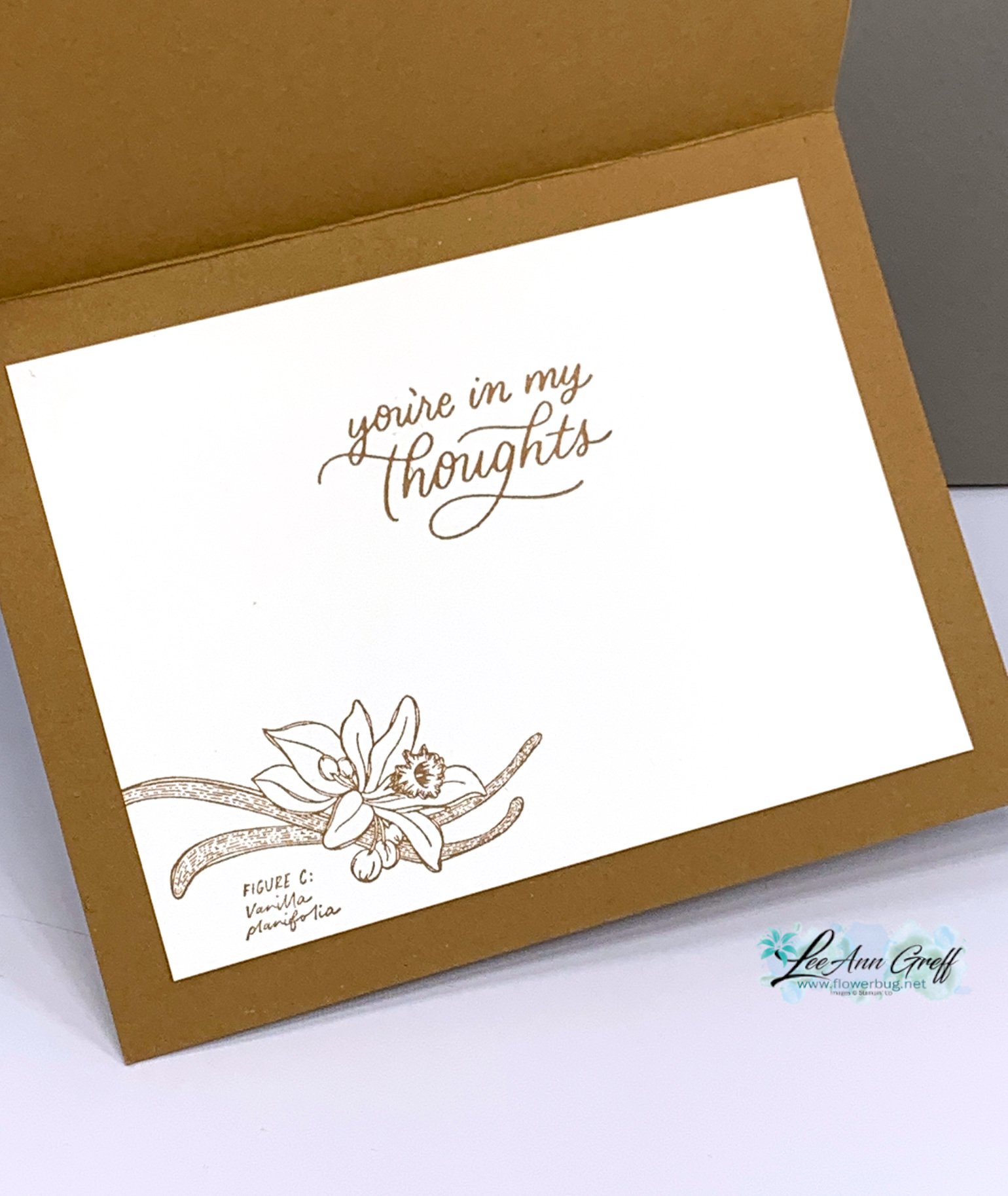
    Here's how I stamped the inside.  The greeting is from the Softly Sophisticated stamp set from Sale-a-Bration. 

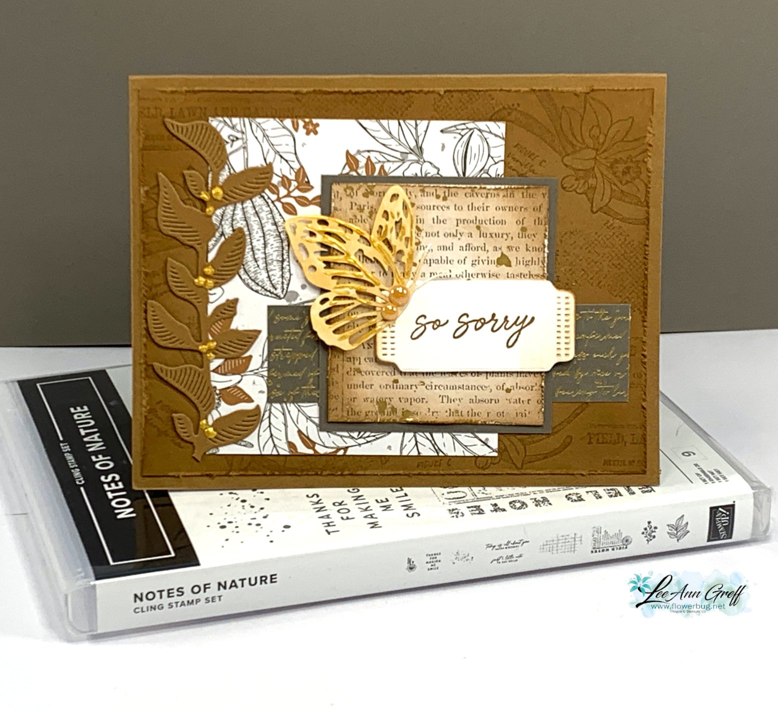
    Here's a picture of the Lovely & Sweet bundle I used here. See it online here. 

    Get the project sheet with dimensions, directions and products here: Download Lovely & Sweet Butterfly card

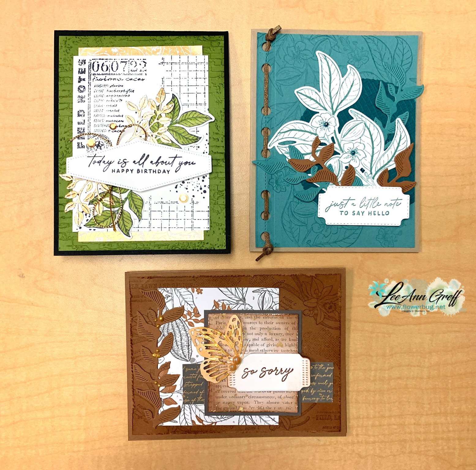
    These are the three cards I share in the video below: 


    So is the shabby-chic look for you?

    You can see how I made all of these cards in the video replay here.  Or click on the photo below to watch it.  Don't forget to subscribe to my YouTube channel! 

    ~~~

    January Specials: 

    Earn FREE products with your Stampin' Up! purchase during

    Sale-a-Bration! *click here

    *current host code link:  M7NAN4HT

    It's the best time to get a pre-paid Sale-a-Bration subscription

    & earn free Sale-a-Bration products!  


    ~~~

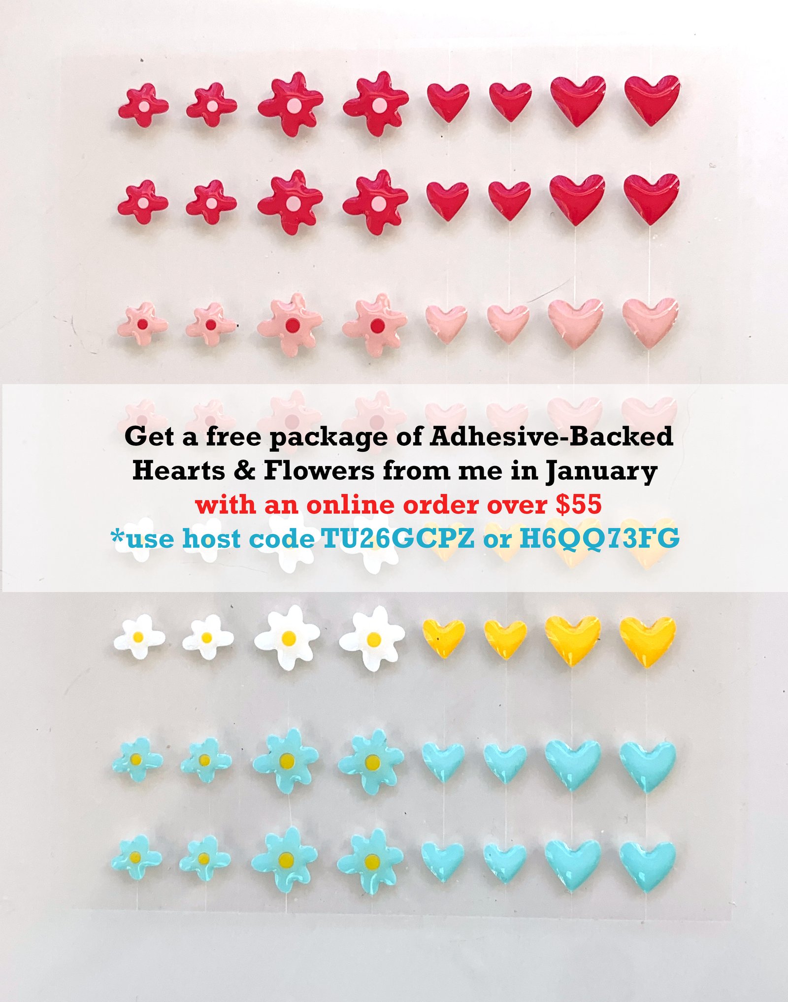
    Get a free embellishment from the 2024 Spring catalog

    with an online order over $55

    Leave a Reply

    Your email address will not be published. Required fields are marked *

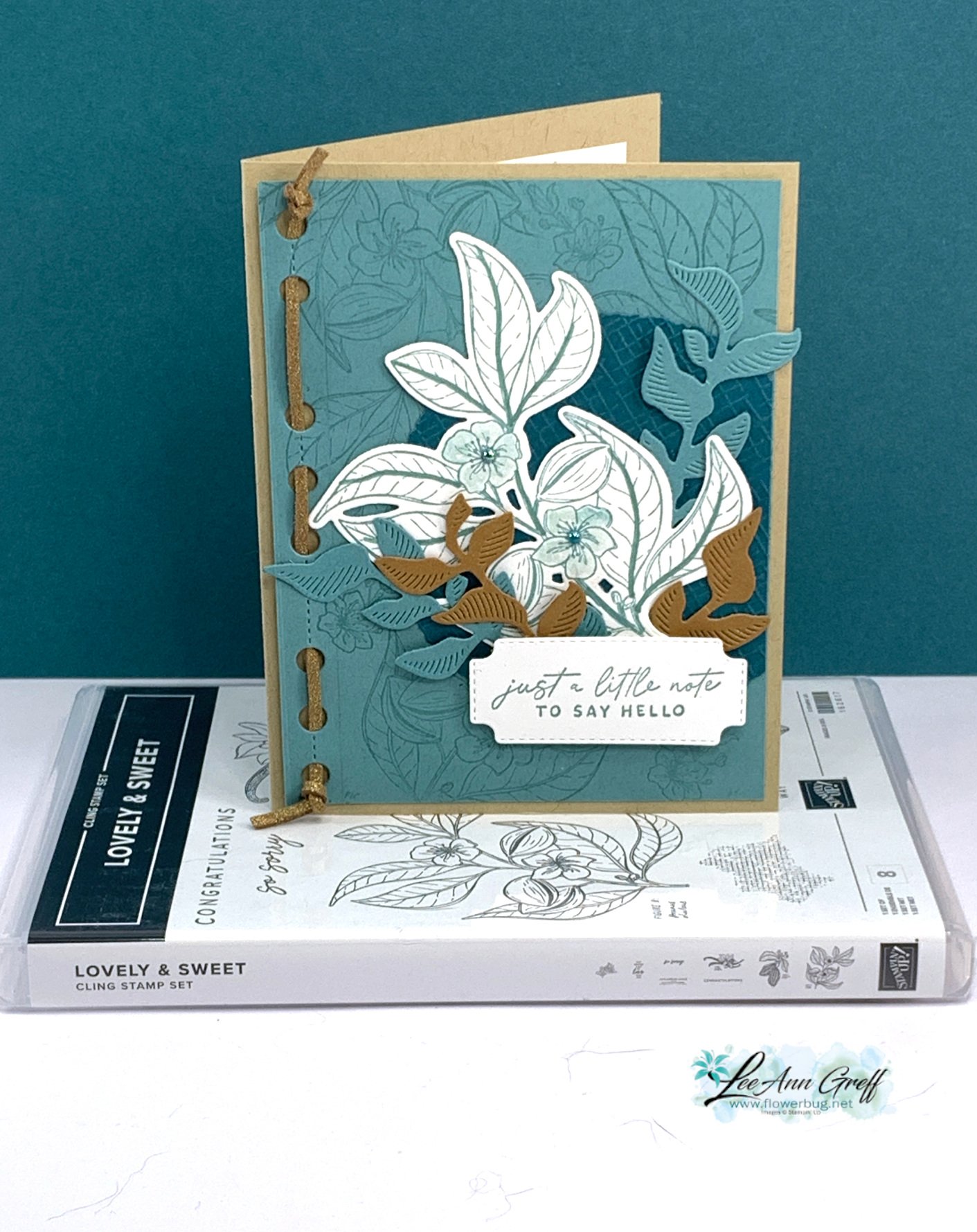
  • Lovely & Sweet card is filled with textures; get the free project sheet or watch the video


    This is one of the cards I featured on last week's Live video. I chose to showcase the Nature's Sweetness suite.  

    The colors include Lost Lagoon, Crumb Cake, Pretty Peacock, White & Pecan Pie. See the neat woven trim on the edge?  that is done with the new Faux Leather trim that has a subtle gold shimmer to it.  The holes and the leaves are made with the Notes of Nature dies seen here. 

    Below is a photo of the entire suite of products. 

    If you order this suite you'll earn two free Sale-a-Bration choices!  Or get it and almost $20 more with the Starter Kit deal! 

    Other dies include the Cheerful Daisies for the label and the Deckled Circles behind the flowers/leaves.  I also used the Wink of Stella with Lost Lagoon ink to color the flowers and added a Blooming Pearl to each one. 

    Click on this link to download the free project sheet: Download Lovely & Sweet Hello

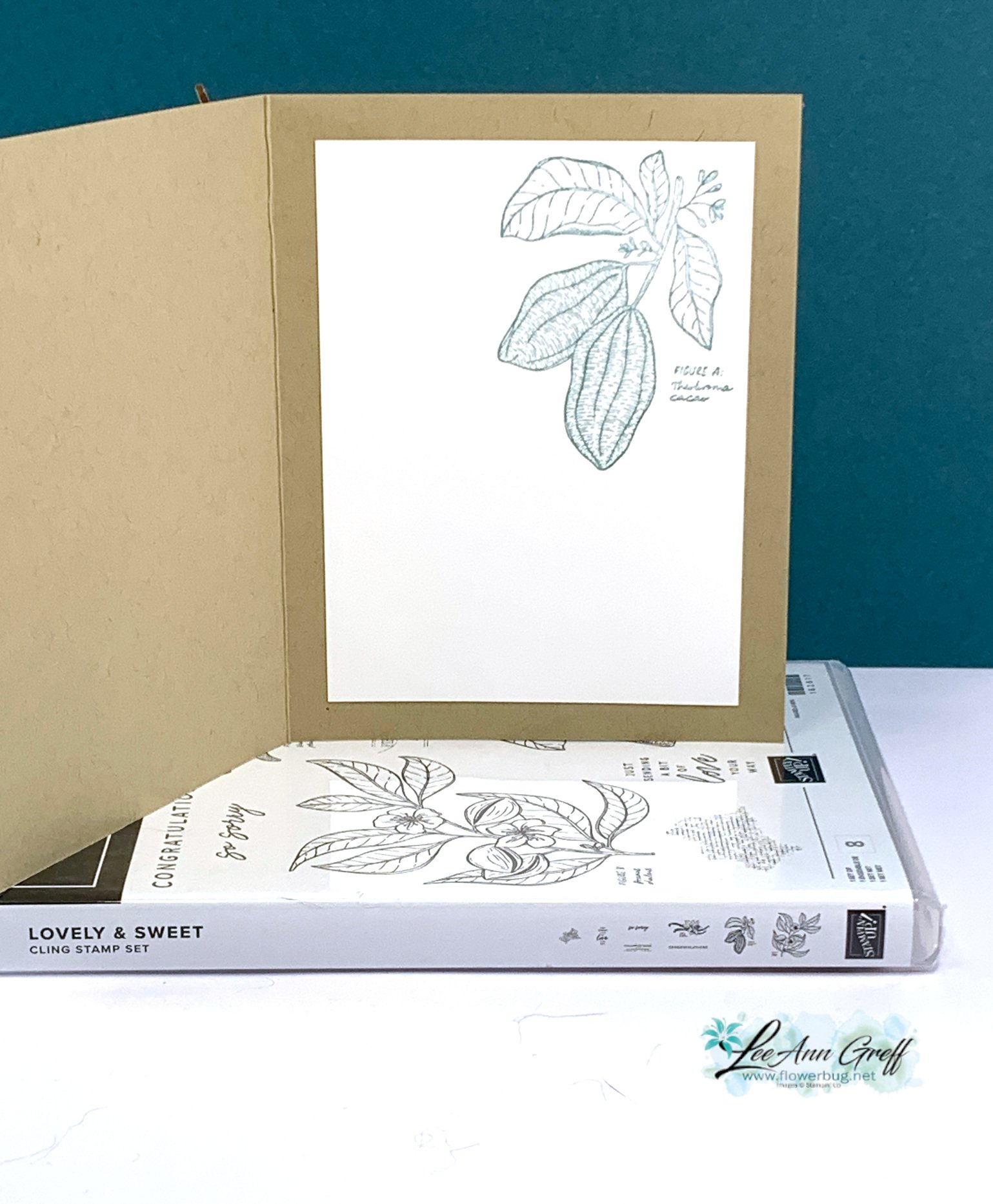
    Here's how I stamped the inside:

    You can see how I put this card together and two more in the video replay here.  Or click on the photo below to watch it. 

    ~~~

    January Specials: 

    Earn FREE products with your Stampin' Up! purchase during

    Sale-a-Bration! *click here

    *current host code link:  M7NAN4HT

    It's the best time to get a pre-paid Sale-a-Bration subscription

    & earn free Sale-a-Bration products!  


    ~~~

    Get a free embellishment from the 2024 Spring catalog

    with an online order over $55

    Leave a Reply

    Your email address will not be published. Required fields are marked *

  • Gorgeous Notes of Nature card with free project sheet & video tutorial


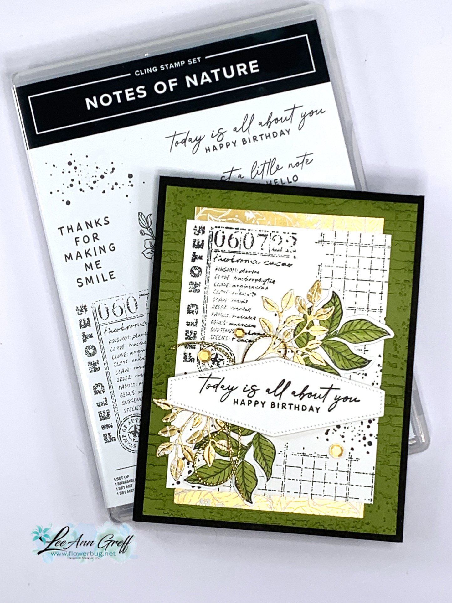
    I had no idea I would enjoy creating with the Nature's Sweetness suite as much as I did. It's not my usual style but I'm in love with it all!  

    Here's one of the cards I shared on last week's video: 

    I used the Notes of Nature bundle and Old Olive, Black and gold accents on this card.  The large white layer is made by stamping a few of the background stamps in Black ink. I added two sets of leaves – one in green and 2 the other in the Gold designer paper. 

    I want to mention what I think puts this card over the top. Of course the gold additions attract your eye but I think repeating colors a few times helps a lot. Notice how the black is repeated, the Olive is and so is the Gold. If you have trouble with color combinations, try adding one color with a neutral or two. Such as Black & White with any color. 

    More Details:

    • I textured the Olive layer with the Exposed Brick embossing folder and used a Blending Brush to add Old Olive ink to it. This really highlights the texture! 
    • Also notice the small strip of Gold designer paper on the top and bottom of the stamped white layer.  This is the Nature's Sweetness specialty paper. 
    • I added gold sequins and gold Elegant trim near the greeting.  

    Click on this link to download the free project sheet: Download Notes of Nature Birthday card

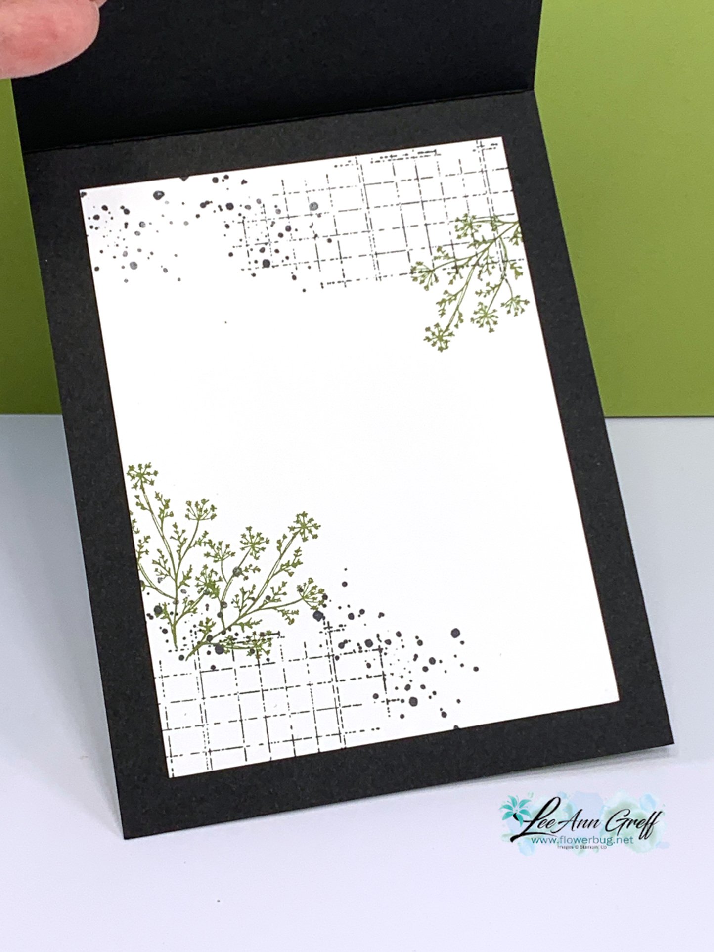
    Here's how I stamped the inside layer: 

    You can see how I made this card and two more in the video replay here.  Or click on the photo below to watch it. 

    ~~~

    January Specials: 

    Earn FREE products with your Stampin' Up! purchase during

    Sale-a-Bration! *click here

    *current host code link:  M7NAN4HT

    It's the best time to get a pre-paid Sale-a-Bration subscription

    & earn free Sale-a-Bration products!  


    ~~~

    Get a free embellishment from the 2024 Spring catalog

    with an online order over $55

    Leave a Reply

    Your email address will not be published. Required fields are marked *


Notice: LeeAnn Greff, Independent Stampin’ Up! Demonstrator, Manager. The content of this website is my sole responsibility as an independent Stampin’ Up! demonstrator and the use of, and content of, the classes, services, or products offered on this website is not endorsed by Stampin’ Up! Copyright 2025