If choosing color combinations is challenging for you the Color Theory video below may help you out.
You can find a printed color wheel in the new Annual Catalog on page 132. Some of us lucky Demo's received a real color wheel at OnStage in Houston. It was a surprise perk for attendees.
Stampin' Up! has heard from many people begging for one since they saw it. Stay tuned; they are producing another that will be available for purchase later this year. In the meantime please watch the video seen further below to see how you can use this color wheel.
Here's a photo of the printed color wheel in the catalog:

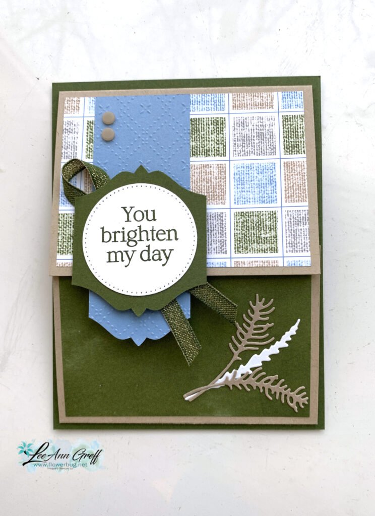
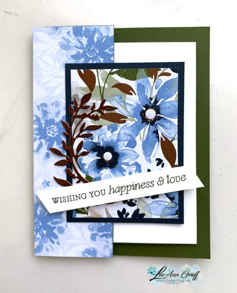
My top favorite and easiest way to combine colors is Monochromatic. This means hues of one color – blues, greens etc. Monochromatic projects are soothing to the eye and can be seamless.
My second favorite is to use complimentary colors such as pink & green or yellow with purple.
If you're using designer paper Stampin' Up! has done the work for you – just choose from the colors listed on the back of each package.
Honestly, how I usually choose colors is to hold the card stock pieces next to each other. For me that's easy, but I know others struggle so I hope the video below will help you out.
~~~
May Specials:
*current host code link: D6QRFZ7J or FCJ937QT

Click on the pictures above or below to get to my new catalog shares – choose from designer papers, In Color bundles or a ribbon share. They're available through May 7th only.


All online orders in May will receive a free multi-project tutorial and a share of !


Leave a Reply