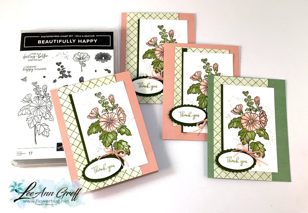
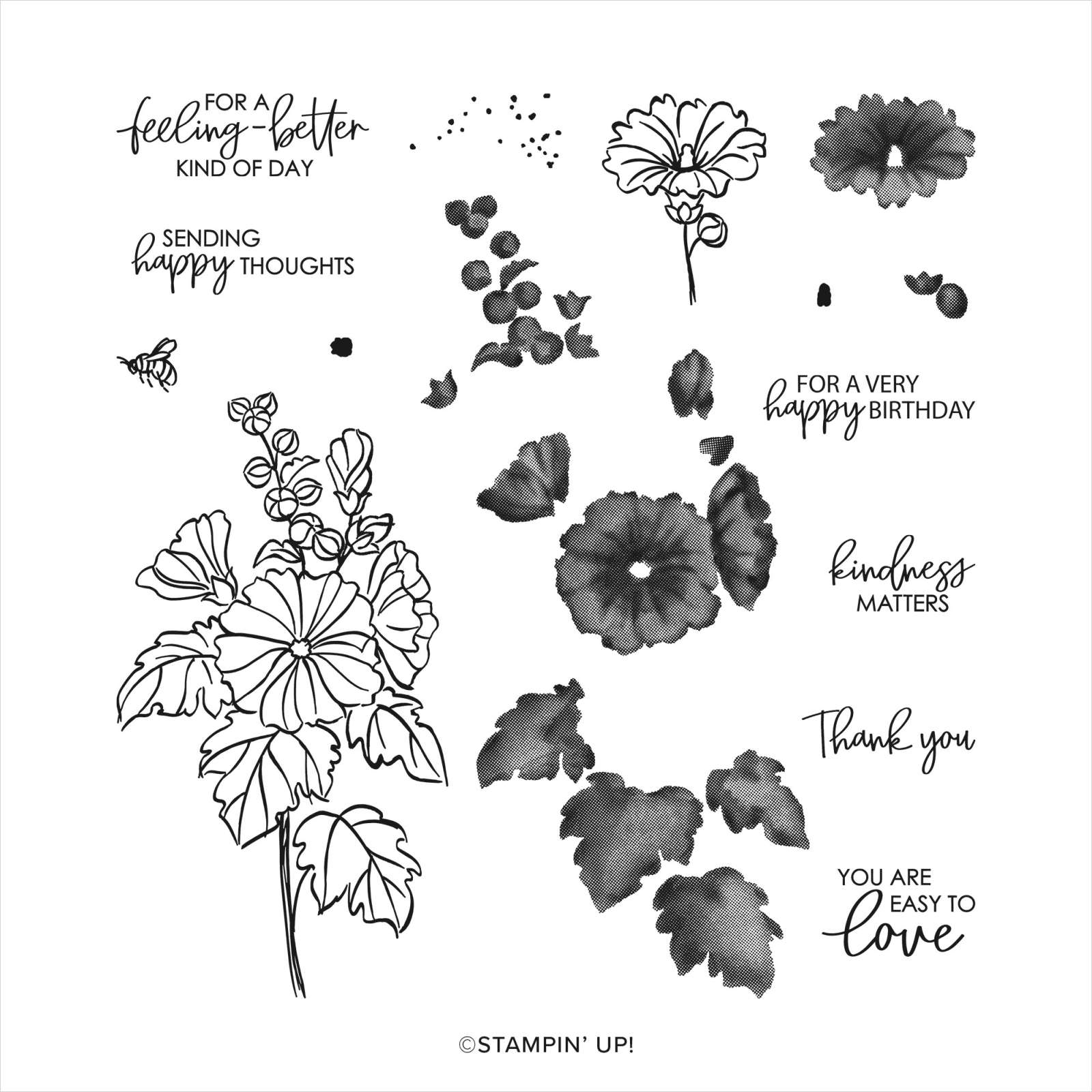
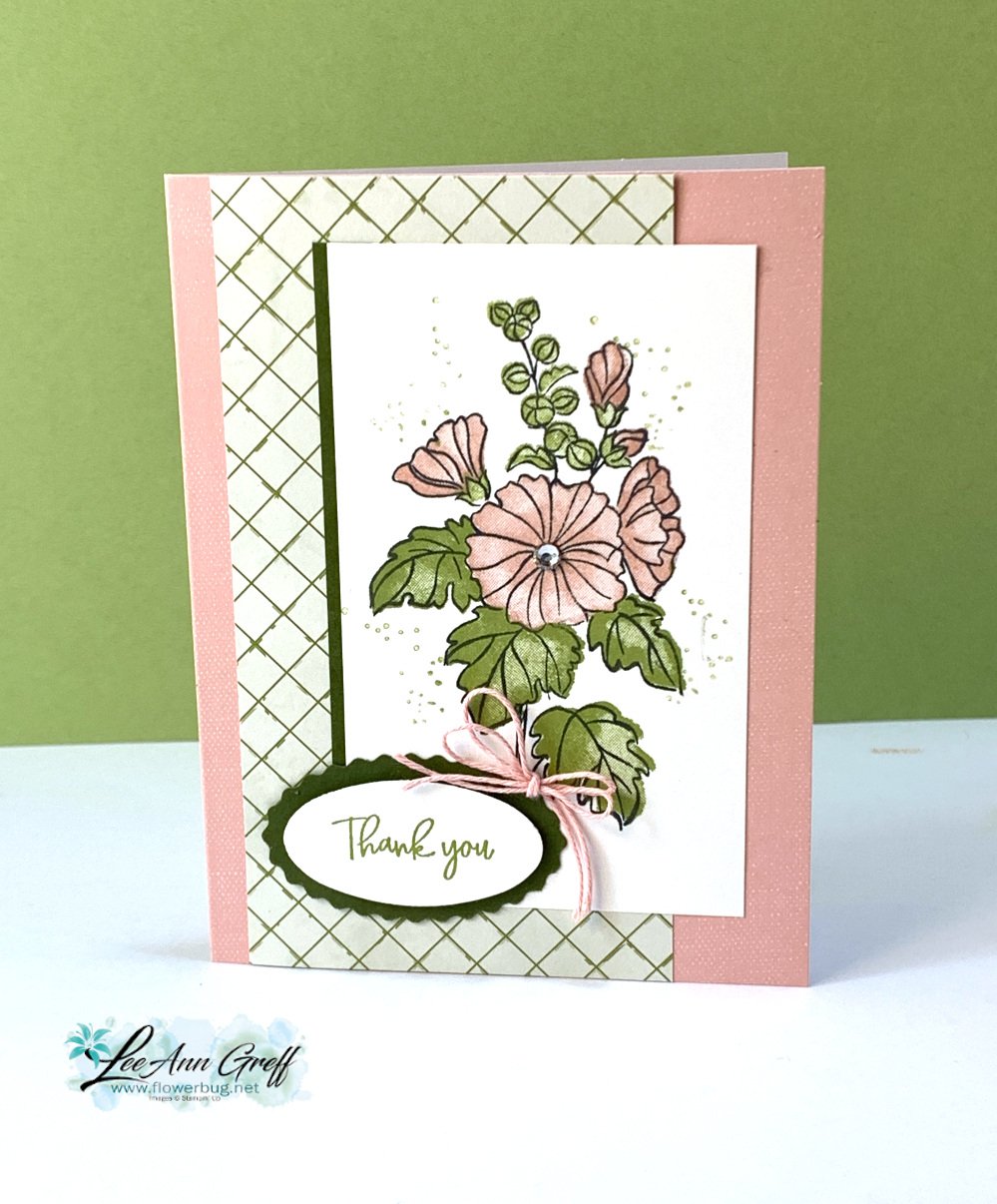
The pretty Beautifully Happy stamp set (Sale-a-Bration and free with a $100 order) is so easy to work with! It has outline images AND coordinating 'fill in' images that make it super simple to add color where you want it. And they're Distinktive images too! This means they give multiple hues of color tones with one stamping. And I love the greetings too.
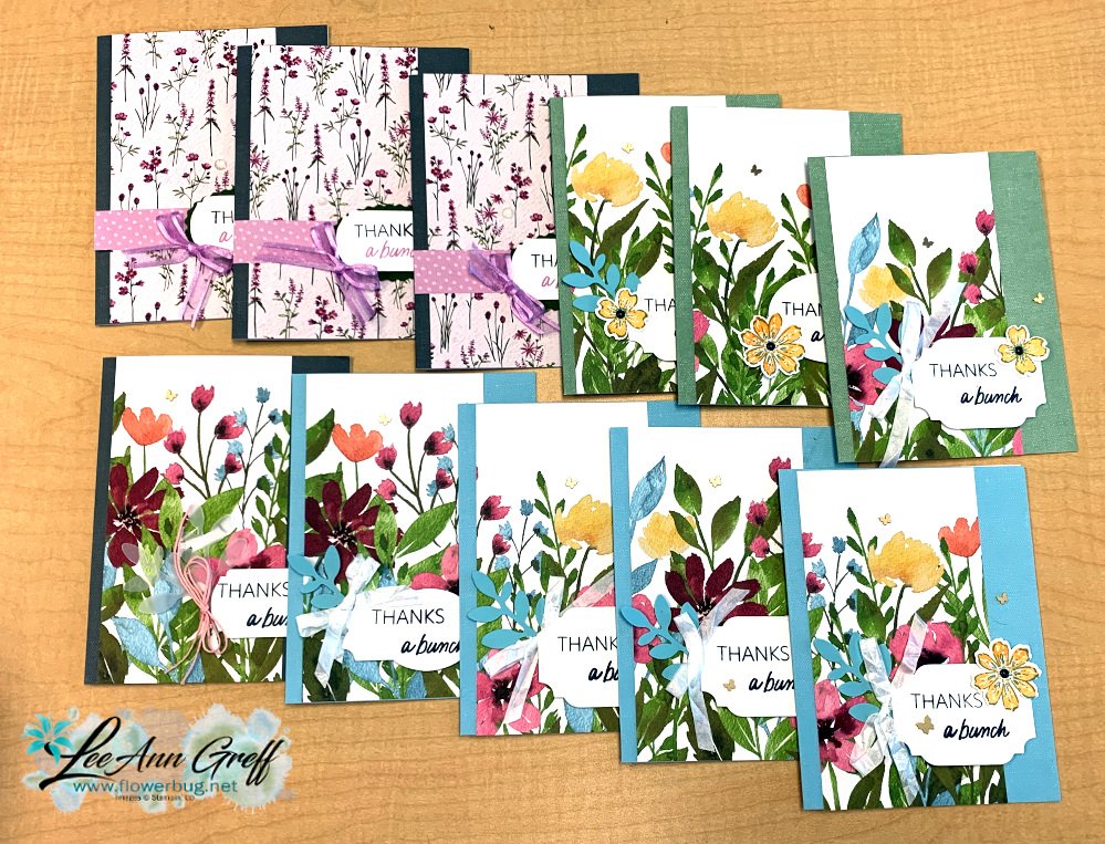
I used the Good Things cards & envelopes for these cards. They were available last month for Paper Pumpkin subscribers, but they're sold out now. I love using coordinating products! I added a 3" X 5 1/2" piece of Design a Daydream Host DSP to each card. I think the lattice look works wonderfully with this flower image.
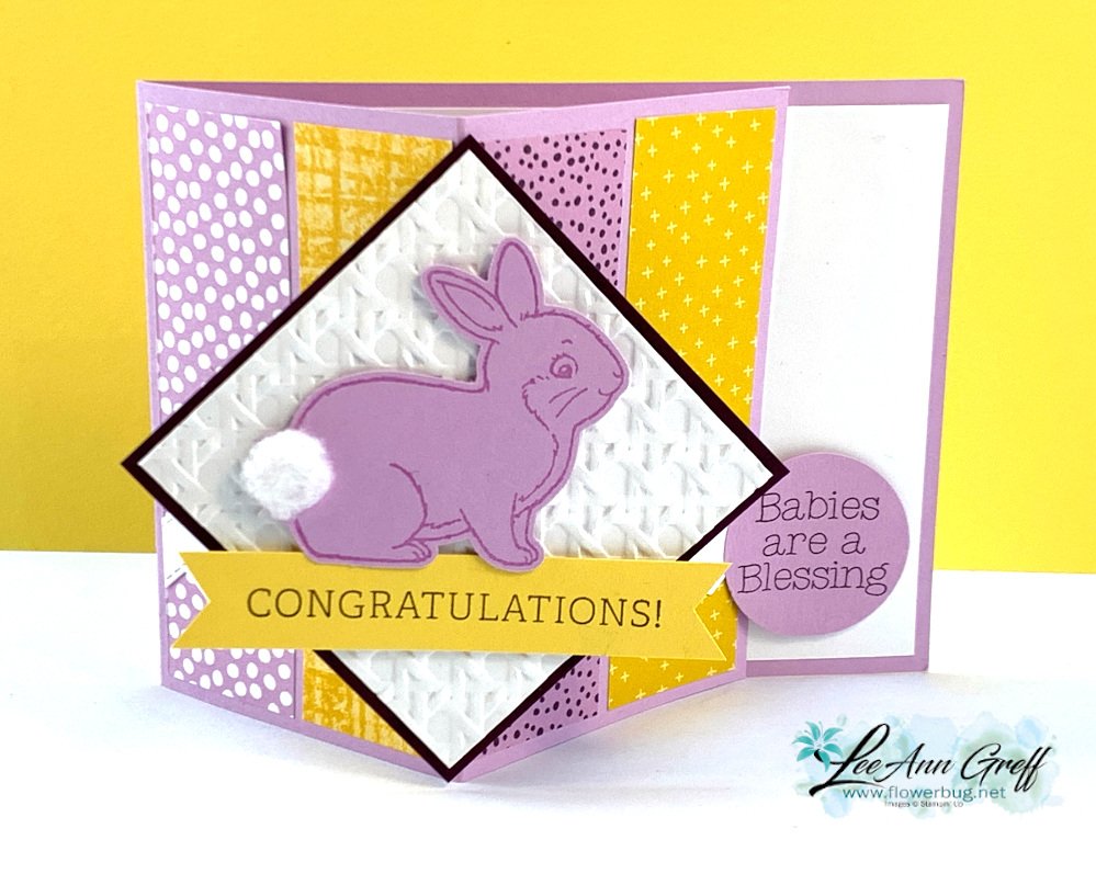
Easter Bunny Floating Panel card with a free project sheet & video tutorial!
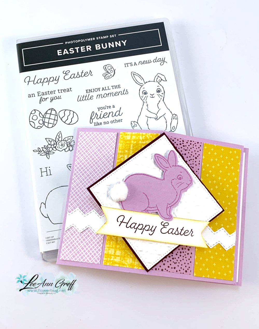
We made this sweet card at my March Card Clubs – it features the Easter Bunny bundle. This bundle is currently unavailable. you can get the Easter Bunny stamp set now but the Bunny punch is returning in May.
It's a Floating Panel fun fold card; one of my current favorite folds lately. It's both fun to make and easy to create too!
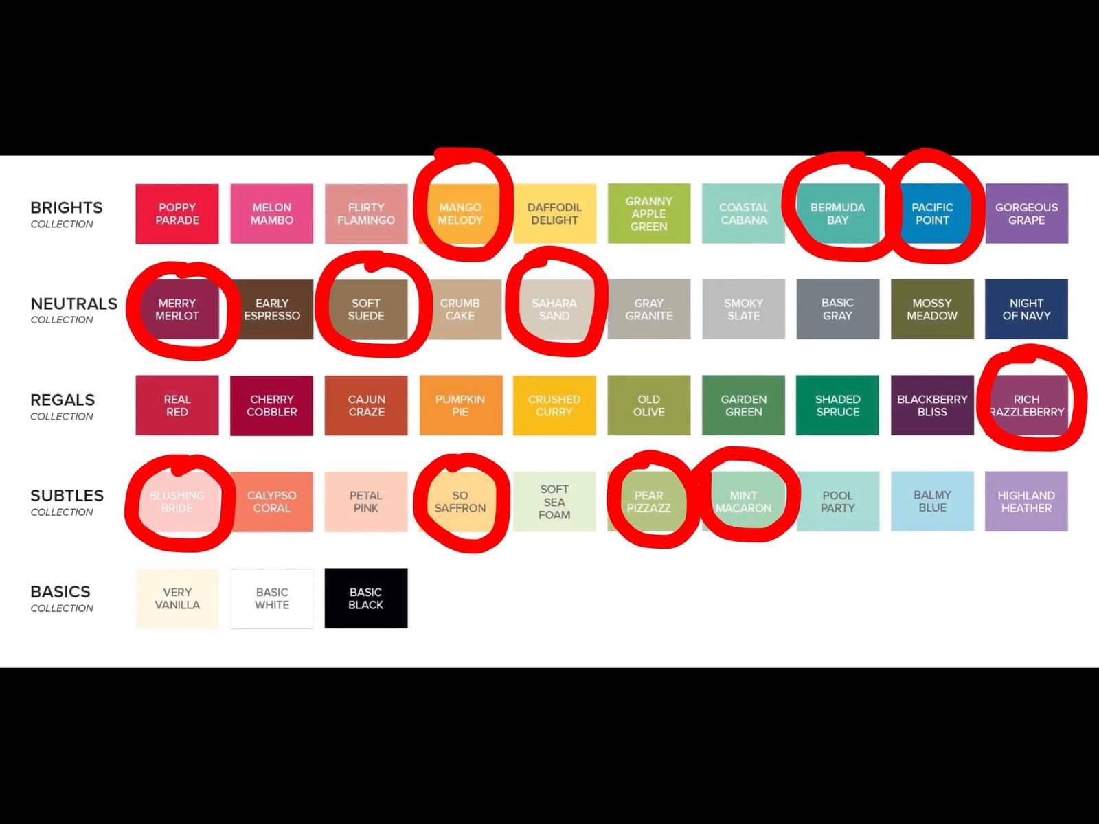
My colors include Fresh Freesia, Blackberry Bliss and Daffodil Delight. Below you'll see the baby version. I gave my gals the choice of Easter or baby.
Card base 4 1/4" X 11" score at 2 3/4" & 5 1/2". Scraps for bunny & circle punch. Two strips 1/2" X 1 1/2" for the floating panel hinges • DSP pieces four pieces at 1 1/4" X 4" • White front square 2 3/4", inside 5 1/4" X 4" • Blackberry Bliss square 2 7/8" • Greeting strips 3/4" X 3 1/2"
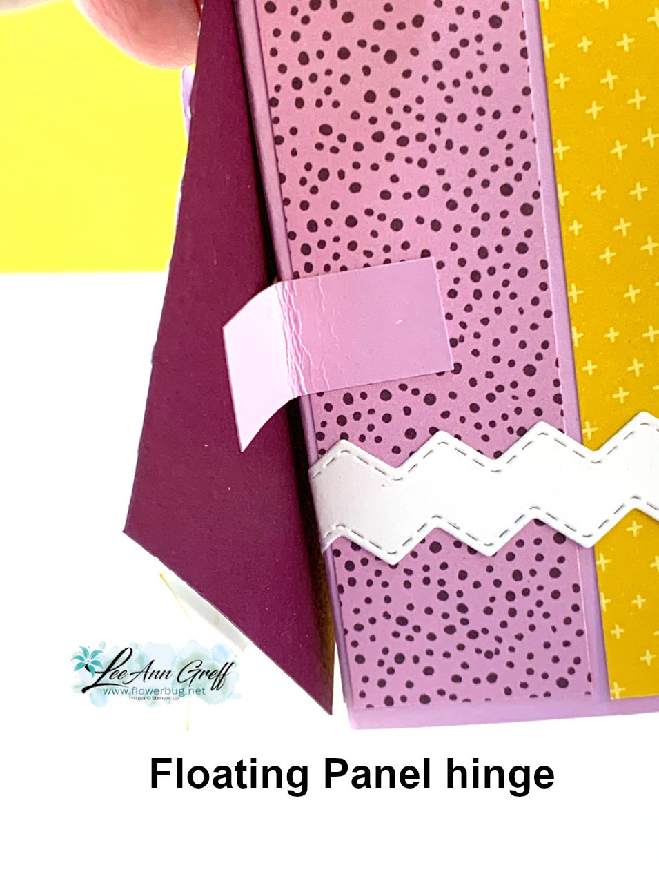
Here's a tip on the Floating panel: You need just two pieces of card stock about 1/2" X 2 1/2". Fold them in half and adhere to the center fold; one on each side. Your front panel is adhered to this.
*Watch the video below (or click here)where I share the tips on creating this card; it's the second project of 4!
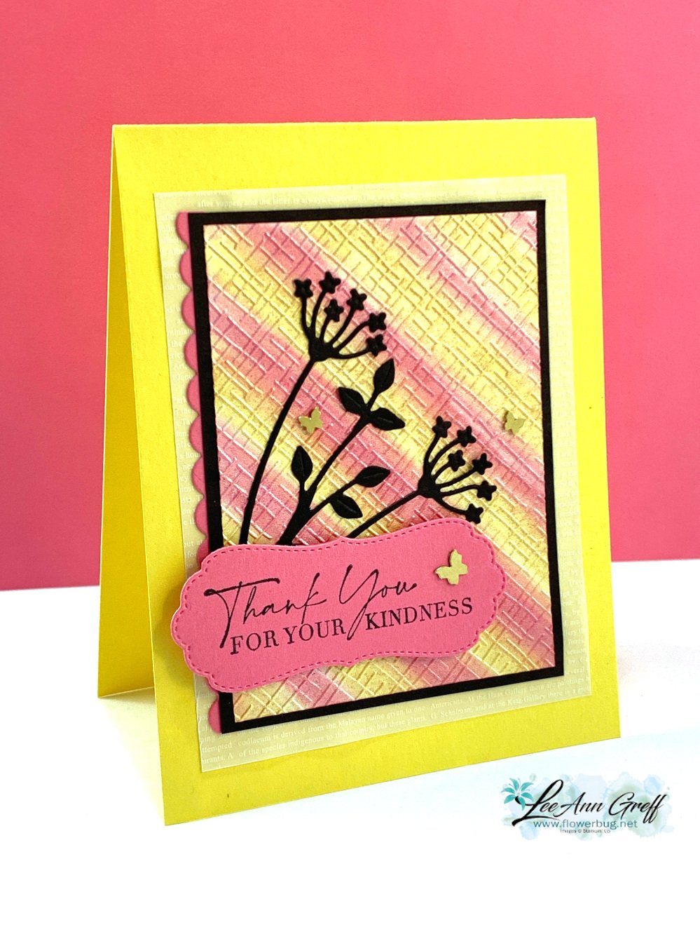
Can you spot the shimmer? I used the Pearlescent paper from the Annual Catalog. See it here.
It was the perfect sheen for this technique as the moist ink did not absorb quickly like it might for regular card stock. Glossy paper would also work well.
After I added the color, I let it dry for an hour or so. Then I textured it with one of the embossing folders in the 3D Basics pack seen here. These are currently out of stock but they'll be back in May.
Below you can see the difference in my cards; especially the colors. One is soft and subtle and the other more vibrant. This happens as you work with your baby wipe; the first few swipes are bold and the next few are much softer.
Tips for success:
Fold and roll your baby wipe in a tube. Hold it tightly and add a few drops of ink refills.
Add each color separately in a row. I tend to add enough for about 1/2" of surface.
Start swiping off your paper and then onto it. You can do straight swipes or get creative and add curves or swirls. Let dry.
Shimmery, pearlescent or glossy works best. But you can do it on regular card stock too.
Notice the colors of the butterflies? I colored the Brass Butterflies with a Polished Pink blends marker for the left card. I wasn't sure I liked it or not so left them uncolored for my swap cards.
Watch the video hereor click on the image below to see this technique. It's the last technique I share in the video.
Notice: LeeAnn Greff, Independent Stampin’ Up! Demonstrator, Manager. The content of this website is my sole responsibility as an independent Stampin’ Up! demonstrator and the use of, and content of, the classes, services, or products offered on this website is not endorsed by Stampin’ Up! Copyright 2025






















Leave a Reply